
More string grids
by Damon Chandler
While string grids are great for displaying large amounts of data, their stock appearance leaves much to be desired. In fact, compared to the grid controls of other applications, such as Microsoft Excel, string grids look downright amateur. And if youĺve ever tried to force a string grid to blend in with the rest of your user interface, youĺve likely discovered that thereĺs a lot that a string grid just canĺt do. For example, you canĺt change the text or background color on a per-cell basis, you canĺt italicize a particular cellĺs font, and you canĺt even change the color used to highlight the selected cells.
Last month, I introduced the basics of the TStringGrid class, how to use many of its key properties, and even some techniques for adding extended functionality. This month, Iĺll show you how to customize a string gridĺs appearance, and even how to place a check box in each cell.
Using the OnDrawCell event
One of the techniques that I discussed last month was how to provide support for per-cell text justification. We accomplished this feat by providing a handler for the OnDrawCell event, in which we simply rendered the text via the DrawText() function.
In fact, the OnDrawCell event can be used for much more than manipulating the alignment of each cellĺs text. You can use this event to further tailor the appearance of the grid on a per-cell basis.
Our previous OnDrawCell event handler was relatively simple because we left the DefaultDrawing property at its default value of true. As such, most of the rendering was handled by the TCustomGrid class itself. However, if you do use this event to perform a more advanced rendering operation, you should set the DefaultDrawing property to false. To understand why, letĺs examine how the TStringGrid and TCustomGrid classes handle the drawing of each cell.
A look inside the rendering routine
Like all TCustomControl descendants, the TCustomGrid class performs its core drawing from within its definition of the virtual Paint() method. Within this function, are two nested functions: DrawLines() and DrawCells(). As you may have guessed, the former is used to render the grid lines, while the latter is used to render the actual cells. It is from within the definition of the DrawCells() function that the pure virtual DrawCell() method is called. If the DefaultDrawing property is true, this method is called after the Font and Brush properties of the gridĺs Canvas have been properly initialized, and after the cellĺs background is filled via the canvasĺ FillRect() method.
The TDrawGrid class defines the DrawCell() method to expose the OnDrawCell event. In fact, except for a little shuffling to support the UseRightToLeftAlignment property, the DrawCell() method simply calls the associated OnDrawCell event handler, if one is assigned. The TStringGrid class augments the DrawCell() method to provide support for textual display. Specifically, the text of each cell is drawn via the canvasĺ TextRect() method. Letĺs look at the definition of the DrawCell() method (translated to C++):
void __fastcall TStringGrid::DrawCell(
  int ACol, int ARow, const TRect& ARect,
  TGridDrawState AState)
{
  if (DefaultDrawing) {
    Canvas->TextRect(ARect,
      ARect.Left + 2, ARect.Top + 2,
      Cells[ACol][ARow]);
  }
  TDrawGrid::DrawCell(
    ACol, ARow, ARect, Astate);
}
You can see from this implementation that the text for each cell is drawn only if the DefaultDrawing property is set to true. Also, notice that the TStringGrid class calls the DrawCell() method of its parent class so that the OnDrawCell event handler is still supported. Moreover, this event handler is called after the string grid renders the cellĺs text.
What does all this mean? Simply put, if you provide a handler for the OnDrawCell event and render something to the string gridĺs Canvas, all while the DefaultDrawing property is set to true, youĺre actually drawing over what the TCustomGrid and TStringGrid classes have already drawn. While this may be fine if youĺre only drawing something simple, or only a limited number of cells, it certainly isnĺt efficient.
Taking control of the rendering process
One of the problems with setting the DefaultDrawing property to false is that youĺre forced to manually implement much of the what the TCustomGrid class draws by default (i.e., when the DefaultDrawing property is true). The advantage, however, is that you have complete control over the appearance of each cell. If youĺre worried about how youĺre going to draw the fixed cells, donĺt be. The Frame3D() VCL utility function makes this task trivial (itĺs declared in EXTCTRLS.HPP). All you need to do is base your rendering process on the information contained in the State parameter. The following OnDrawCell event handler demonstrates how to make a string grid look ônormalö when the DefaultDrawing property is false:
#include <cassert>
void __fastcall
TForm1::StringGrid1DrawCell(
  TObject *Sender, int ACol, int ARow,
  TRect &Rect, TGridDrawState State)
{
  TStringGrid* StringGrid =
    static_cast<TStringGrid*>(Sender);
  assert(StringGrid != NULL);

  TCanvas* SGCanvas =StringGrid->Canvas;
  SGCanvas->Font = StringGrid->Font;

  RECT RText = static_cast<RECT>(Rect);
  const AnsiString text(
    StringGrid->Cells[ACol][ARow]);

  const bool fixed =
    State.Contains(gdFixed);
  const bool focused =
    State.Contains(gdFocused);
  bool selected =
    State.Contains(gdSelected);
  if (!StringGrid1->Options.Contains(
    goDrawFocusSelected)) {
    selected = selected && !focused;
  }
  // if the cell is fixed (headers)
  if (fixed) {
    SGCanvas->Brush->Color =
      StringGrid1->FixedColor;
    SGCanvas->Font->Color = clBtnText;
    SGCanvas->FillRect(Rect);
    Frame3D(SGCanvas, Rect,
      clBtnHighlight, clBtnShadow, 1);
  }
  // if the cell is selected
  else if (selected) {
    SGCanvas->Brush->Color =clHighlight;
    SGCanvas->Font->Color =
      clHighlightText;
    SGCanvas->FillRect(Rect);
  }
  // if the cell is normal
  else {
    SGCanvas->Brush->Color =
      StringGrid1->Color;
    SGCanvas->Font->Color =
      StringGrid1->Font->Color;
    SGCanvas->FillRect(Rect);
  }
  // if the cell is focused
  if (focused) {
    DrawFocusRect(
      SGCanvas->Handle, &RText);
  }

  // draw the text
  RText.left += 2; RText.top += 2;
  DrawText(SGCanvas->Handle,
    text.c_str(), text.Length(), &RText,
    DT_LEFT |DT_VCENTER |DT_SINGLELINE);
}
There are, in fact, a few more conditions to test when the Options property contains the goRowSelect flag, but you get the idea. Still, weĺve written 40 lines of code just to make the string grid look normal. Whatĺs the point? Since the DefaultDrawing property is indeed false, you can be sure that the TCustomGrid and TStringGrid classes arenĺt drawing anything that youĺre going to draw over. And as an added bonus, you have total control over the appearance of the focus rectangle. The main advantage, however, is efficiency.
Using the OnDrawCell event, you can change the way each cell is rendered by implementing your rendering code based on the ACol, ARow, and State parameters. For example, you can use the following approach to change the appearance of the selected cells, and the background color of every other non-selected row. The result is depicted in Figure A:
void __fastcall TForm1::
  StringGrid1DrawCell(TObject *Sender,
  int ACol, int ARow, TRect &Rect,
  TGridDrawState State)
{
  // other code from before...

  // if the cell is selected
  else if (selected) {
    unsigned char step = 30;
    unsigned char r = 0x80,
      g = 0x80, b = 0xC0;
    TColor clr_highlight =
      static_cast<TColor>(PALETTERGB(
        r + step, g + step, b + step));
    TColor clr_shadow =
      static_cast<TColor>(PALETTERGB(
        r - step, g - step, b - step));

    SGCanvas->Brush->Color =
      static_cast<TColor>(
        PALETTERGB(r, g, b));
    SGCanvas->Font->Color = clWhite;
    SGCanvas->Font->Style =
      SGCanvas->Font->Style << fsItalic;

    SGCanvas->FillRect(Rect);
    Frame3D(SGCanvas, Rect,
      clr_shadow, clr_highlight, 3);
  }
  // if the cell is normal
  else {
    if (ARow % 2 == 0)
      SGCanvas->Brush->Color = clInfoBk;
    else
      SGCanvas->Brush->Color =
        StringGrid1->Color;

    SGCanvas->Font->Color =
      StringGrid1->Font->Color;
    SGCanvas->FillRect(Rect);
  }
  // other code from before...
}
Figure A
A string grid with every other non-fixed row rendered in clInfoBk and the selected cells drawn with a sunken look.
When you use the OnDrawCell event in conjunction with the TStringGridĺs Objects property, you have a solid framework for customizing the appearance of each cell. In fact, this is identically the approach weĺll take when we render a check box to each cell; weĺll use the Objects property to hold the state of each check box.
Adding a check box to each cell
Most grids contain hundreds, even thousands, of cells. If you place, for example, a TCheckBox control in each cell, youĺre looking at consuming a large number of window handles, and thus, system resources. For simple controls such as check boxes or buttons, there is an alternative approachŚthe DrawFrameControl() function. As it name suggests, DrawFrameControl() can be used to draw a wide variety of controls, including push buttons, check boxes, popup menu items, and even title bar buttons. Here, weĺll use this function to draw a check box to each cell.
Storing the state of each check box
Again, the main advantage of rendering each check box manually is that we avoid the overhead of numerous TCheckBox objects. The main disadvantage is that we have to manually implement the check boxĺs functionality. Still, as mentioned previously, we can store the state of each check box in the Objects property. To this end, weĺll need a few helper functions:
bool __fastcall GetCheckState(
  TStringGrid& AGrid, int ACol,int ARow)
{
  return HIWORD(reinterpret_cast<long>(
    AGrid.Objects[ACol][ARow]));
}

void __fastcall SetCheckState(
  TStringGrid& AGrid,
  int ACol, int ARow, bool AChecked)
{
  long data = reinterpret_cast<long>(
    AGrid.Objects[ACol][ARow]);
  AGrid.Objects[ACol][ARow] =
    reinterpret_cast<TObject*>(
      MAKELONG(LOWORD(data), AChecked));
}
These two functions simply provide an easy means by which to set and get the checked state of each cell, to and from the Objects property, respectively (we store this state in the high-order word). Thereĺs no need to invalidate the cell (i.e., incite a repaint) once the state is changed, since the TStringGrid performs this when the Objects property itself is changed. In fact, if you ever do need to repaint a particular cell, you can simply assign the Objects property of that cell to the value that it already contains:
void __fastcall InvalidateCell(
 TStringGrid& AGrid, int ACol, int ARow)
{
  AGrid.Objects[ACol][ARow] =
    AGrid.Objects[ACol][ARow];
}
In addition to storing the state of each check box, weĺll need a function that can be used to determine if a cell indeed contains a check box, and another function that can be used to add a check box to each cell. Weĺll store this ôhas_check_boxö flag in the low-order word of the Objects property:
bool __fastcall GetCheckBox(
 TStringGrid& AGrid, int ACol, int ARow)
{
  return LOWORD(reinterpret_cast<long>(
    AGrid.Objects[ACol][ARow]));
}

void __fastcall SetCheckBox(
 TStringGrid& AGrid, int ACol, int ARow,
 bool AShow, bool AChecked)
{
  AGrid.Objects[ACol][ARow] =
    reinterpret_cast<TObject*>(
      MAKELONG(AShow, false));
  SetCheckState(
    AGrid, ACol, ARow, AChecked);
}
Rendering the check boxes
Putting our functions to good use, we can define the OnDrawCell event handler as listed below. Again, to actually render each check box, weĺll use the DrawFrameControl() function:
#include <cassert>
void __fastcall
TForm1::StringGrid1DrawCell(
  TObject *Sender, int ACol, int ARow,
  TRect &Rect, TGridDrawState State)
{
  // other code from before...

  // if this cell contains a checkbox
  if (GetCheckBox(
        *StringGrid, ACol, ARow)) {
    // set the flags for rendering
    // checked/unchecked
    unsigned int state =
      DFCS_BUTTONCHECK;
    if (GetCheckState(
          *StringGrid, ACol, ARow)) {
        state = state | DFCS_CHECKED;
    }

    // size the checkbox
    RECT RCell =static_cast<RECT>(Rect);
    OffsetRect(&RCell, 2,
      0.5 * (RCell.bottom - RCell.top));
    RCell.right = RCell.left +
      GetSystemMetrics(SM_CXMENUCHECK);
    RCell.bottom = RCell.top +
      GetSystemMetrics(SM_CYMENUCHECK);
    RCell.top -= 0.5 *
      (RCell.bottom - RCell.top) + 2;

    // draw the checkbox
    DrawFrameControl(
      StringGrid1->Canvas->Handle,
      &RCell, DFC_BUTTON, state);

    // move the text over
    RText.left = RCell.right;
  }

  // draw the text
  RText.left += 2; RText.top += 2;
  DrawText(SGCanvas->Handle,
    text.c_str(), text.Length(), &RText,
    DT_LEFT |DT_VCENTER |DT_SINGLELINE);
}
Interacting with the check boxes
In addition to displaying each check box, weĺll need to change its state when itĺs clicked or when the spacebar is pressed while the corresponding cell is focused. For the former, we can perform a hit test via a combination of TStringGridĺs CellRect() method and the PtInRect() function. For the latter, we can simply use the string gridĺs OnKeyPress event:
bool __fastcall PtInCheckBox(
  TStringGrid& AGrid, int AX, int AY,
  int &ACol, int &ARow)
{
  AGrid.MouseToCell(AX, AY, ACol, ARow);
  RECT RCell = static_cast<RECT>(
    AGrid.CellRect(ACol, ARow));

  OffsetRect(&RCell, 2,
    0.5 * (RCell.bottom - RCell.top));
  RCell.right = RCell.left +
    GetSystemMetrics(SM_CXMENUCHECK);
  RCell.bottom = RCell.top +
    GetSystemMetrics(SM_CYMENUCHECK);
  RCell.top -= 0.5 *
    (RCell.bottom - RCell.top) + 2;

  return
    PtInRect(&RCell, Point(AX, AY));
}

// OnMouseDown event handler:
void __fastcall TForm1::
  StringGrid1MouseDown(TObject *Sender,
  TMouseButton Button,
  TShiftState Shift, int X, int Y)
{
  TStringGrid* StringGrid =
    static_cast<TStringGrid*>(Sender);
  assert(StringGrid != NULL);

  int Col, Row;
  if (PtInCheckBox(
       *StringGrid, X, Y, Col, Row)) {
    if (GetCheckBox(
         *StringGrid, Col, Row)) {
      bool is_checked = GetCheckState(
        *StringGrid, Col, Row);
      SetCheckState(*StringGrid,
        Col, Row, !is_checked);
    }
  }
}

// OnKeyPress event handler:
void __fastcall
TForm1::StringGrid1KeyPress(
  TObject *Sender, char &Key)
{
  TStringGrid* StringGrid =
    static_cast<TStringGrid*>(Sender);
  assert(StringGrid != NULL);

  if (Key == VK_SPACE) {
    const int col = StringGrid->Col;
    const int row = StringGrid->Row;

    if (GetCheckBox(
         *StringGrid, col, row)) {
      SetCheckState(*StringGrid, col,
        row, !GetCheckState(
          *StringGrid, col, row));
    }
  }
}
With the above implementation in place, and through use of our SetCheckBox() function to add a check box to each non-fixed cell, we get the result depicted in Figure B.
Figure B
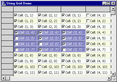
A customized string grid with a check box in each non-fixed cell.
Conclusion
While string grids may, at first, look rather bland, you should be convinced at this point that there is much room for enhancement. In fact, once youĺve implemented a robust OnDrawCell event handler, tailoring the appearance of a string grid is fairly straightforward. You can even use the code presented in this article, which can be downloaded from www.bridgespublishing.com, as a starting point.
Iĺve demonstrated how to add a check box to each cell, but youĺre certainly not limited to this type of control. As mentioned, the DrawFrameControl() function can be used to render a wide variety of controls. And if you need something more complex in each cell, such as a tree view, you can use the DrawFrameControl() function to draw the drop-down button of a combo box. In this way, you can display a small popup window that contains any type of control.