Last month, I showed you how to create an owner-drawn button; and we worked through a specific example of creating a colored-button component. In this month’s article, I’ll discuss two things: (1) how to add a glyph to the button; and (2) how to define the button’s face by using a custom bitmap.
Listing A contains the declaration of the TColorButton class, which I’ve changed from last month’s version by adding support for a glyph. Specifically, I added a property called Glyphs that specifies a pointer to a TImageList object, and a property called GlyphIndex that specifies the index of the button’s glyph within the image list. (Also notice that I added a Canvas property so that descendant classes can access the private Canvas_ member.) The Glyphs and GlyphIndex properties are supported via the private Glyph_ and GlyphIndex_ members, which are initialized in the class constructor like so:
__fastcall TColorButton::
  TColorButton(TComponent* Owner)
    : TButton(Owner),
    ColorLo_(clBtnShadow),
    ColorHi_(clBtnHighlight),
    Canvas_(new TCanvas()),
    draw_as_default_(false),
    GlyphIndex_(0), Glyphs_(NULL)
{
}
The Glyph_ and GlyphIndex_ members are used from within the DoDrawButtonGlyph() method, which—as you can guess—is used to draw the button’s glyph. Here’s the code for one version of that method:
void __fastcall TColorButton::
  DoDrawButtonGlyph(
    const TOwnerDrawState& state)
{
  if (Glyphs_ && GlyphIndex_ >= 0)
  {
    // compute the width of the
    // caption (in pixels)
    Canvas_->Font = Font;
    const int text_width =
      Canvas->TextWidth(Caption) + 2;

    // compute the correct position at
    // which to draw the glyph
    TPoint PGlyph = Point(
      (Width - text_width -
       Glyphs_->Width) / 2.0,
      (Height -
       Glyphs_->Height + 2) / 2.0
      );

    // offset the glyph if the
    // button is pushed
    if (state.Contains(odSelected))
    {
      PGlyph.x += 1;
      PGlyph.y += 1;
    }

    // render the glyph...
    Glyphs_->Draw(
      Canvas_.get(), PGlyph.x, PGlyph.y,
      GlyphIndex_, Enabled);
  }
}
Because Glyphs_ is a pointer to a TImageList object, drawing the button’s glyph is simple, even if the button is disabled. Recall that the last parameter of the TImageList::Draw() method is a Boolean that specifies whether the image should be rendered as enabled (true) or disabled (false). Unfortunately, however, the Draw() method will always use clBtnShadow and clBtnHighlight for the disabled glyph’s shadows and highlights, respectively. This is fine if your button’s color is clBtnFace, but it looks weird if you use most other colors. Moreover, in some versions of C++Builder, the TImageList::Draw() method accepts only four parameters. Because of these limitations, let’s examine an alternative technique for drawing a disabled glyph. The following function demonstrates how to use masking to do so:
void __fastcall DrawDisabledGlyph(
    TCanvas& Canvas,
    const TPoint& PDraw,
    TImageList& ImageList,
    int index,
    TColor ColorShadow,
    TColor ColorHilite)
{
  static const int MASKPAT = 0x00E20746;

  // STEP 1: Create the mask bitmap
  const SIZE SImg = {
    ImageList.Width, ImageList.Height};
  std::auto_ptr<Graphics::TBitmap>
    MaskBitmap(new Graphics::TBitmap());
  MaskBitmap->Monochrome = true;
  MaskBitmap->Width = SImg.cx;
  MaskBitmap->Height = SImg.cy;

  const HDC hDCSrc =
    MaskBitmap->Canvas->Handle;
  PatBlt(
    hDCSrc, 0, 0, SImg.cx, SImg.cy,
    WHITENESS
    );
  ImageList.Draw(MaskBitmap->Canvas,
    0, 0, index, true);

  // STEP 2: Render the highlights
  Canvas.Brush->Color = ColorHilite;
  HDC hDCDst = Canvas.Handle;
  SetTextColor(
    hDCDst, ColorToRGB(clWhite));
  SetBkColor(
    hDCDst, ColorToRGB(clBlack));
  BitBlt(hDCDst, PDraw.x + 1,
    PDraw.y + 1, SImg.cx, SImg.cy,
    hDCSrc, 0, 0, MASKPAT);

  // STEP 3: Render the shadows
  Canvas.Brush->Color = ColorShadow;
  hDCDst = Canvas.Handle;
  SetBkColor(
    hDCDst, ColorToRGB(clBlack));
  BitBlt(hDCDst, PDraw.x, PDraw.y,
    SImg.cx, SImg.cy, hDCSrc, 0, 0,
    MASKPAT);
}
The DrawDisabledGlyph() function works by using a mask bitmap and the BitBlt() GDI function—specifying the MASKPAT ternary raster operation—to render the disabled glyph’s highlights and shadows transparently (i.e., without disturbing the background).
With the DrawDisabledGlyph() function defined, we can now modify the DoDrawButtonGlyph() method accordingly:
void __fastcall TColorButton::
  DoDrawButtonGlyph(
    const TOwnerDrawState& state)
{
  if (Glyphs_ && GlyphIndex_ >= 0)
  {
    // compute the width of the
    // caption (in pixels)
    Canvas_->Font = Font;
    const int text_width =
      Canvas->TextWidth(Caption) + 2;

    // compute the correct position at
    // which to draw the glyph
    TPoint PGlyph = Point(
      (Width - text_width -
       Glyphs_->Width) / 2.0,
      (Height -
       Glyphs_->Height + 2) / 2.0);

    // offset the glyph if the
    // button is pushed
    if (state.Contains(odSelected))
    {
      PGlyph.x += 1;
      PGlyph.y += 1;
    }

    // render the glyph...
    if (!Enabled ||
        state.Contains(odDisabled))
    {
      DrawDisabledGlyph(
        *(Canvas_.get()),
        Point(PGlyph.x, PGlyph.y),
        *Glyphs_, GlyphIndex_,
        ColorLo, ColorHi);
    }
    else
    {
      Glyphs_->Draw(Canvas_.get(),
        PGlyph.x, PGlyph.y, GlyphIndex_,
        true);
    }
  }
}
The next task is to modify the CNDrawItem() method so that the DoDrawButtonGlyph() method will be called. Here’s the code for that:
void __fastcall TColorButton::
  CNDrawItem(TMessage& Msg)
{
  // grab a pointer to the DRAWITEMSTRUCT
  const DRAWITEMSTRUCT* pDrawItem =
    reinterpret_cast<DRAWITEMSTRUCT*>
      (Msg.LParam);

  // store the current state of the DC
  SaveDC(pDrawItem->hDC);
  // bind Canvas_ to the target DC
  Canvas_->Handle = pDrawItem->hDC;
  try
  {
    // extract the state flags...
    TOwnerDrawState state;
    // if the button has keyboard focus
    if (pDrawItem->itemState & ODS_FOCUS)
    {
      state = state << odFocused;
    }
    // if the button is pushed
    if (pDrawItem->itemState &
        ODS_SELECTED)
    {
      state = state << odSelected;
    }
    // if the button is disabled
    if (pDrawItem->itemState &
        ODS_DISABLED)
    {
      state = state << odDisabled;
    }

    // draw the button's face
    DoDrawButtonFace(state);

    // draw the button's glyph
    DoDrawButtonGlyph(state);

    // draw the button's text
    DoDrawButtonText(state);
  }
  catch (...)
  {
    // clean up
    Canvas_->Handle = NULL;
    RestoreDC(pDrawItem->hDC, -1);
  }
  // clean up
  Canvas_->Handle = NULL;
  RestoreDC(pDrawItem->hDC, -1);

  // reply TRUE
  Msg.Result = TRUE;
}
Notice that this version of CNDrawItem() is nearly identical to that of last month’s article. Here I’ve simply placed a call to DoDrawButtonGlyph() between the calls to DoDrawButtonFace() and DoDrawButtonText(). It’s important that the DoDrawButtonGlyph() method is called before DoDrawButtonText() because it's from within the latter method that the selection rectangle is drawn.
There’s one last modification that needs to be made. Namely, the DoDrawButtonText() method needs to be changed so that the button’s caption and its glyph don’t overlap:
void __fastcall TColorButton::
  DoDrawButtonText(
    const TOwnerDrawState& state)
{
  if (Caption.Length() == 0) return;

  RECT RText = {0, 0, Width, Height};
  SetBkMode(
    Canvas_->Handle, TRANSPARENT);

  // if the button has a glyph
  if (Glyphs_ && GlyphIndex_ >= 0)
  {
    RText.left += Glyphs_->Width + 6;
  }

  // other code from before...
}
And, in case you’re wondering, here’s the code for the SetGlyphs() and SetGlyphIndex() methods:
void __fastcall TColorButton::
SetGlyphIndex(int Value)
{
if (GlyphIndex_ != Value)
{
GlyphIndex_ = Value;
InvalidateRect(Handle, NULL, FALSE);
}
}
void __fastcall TColorButton::
SetGlyphs(TImageList* Value)
{
if (Glyphs_ != Value)
{
Glyphs_ = Value;
InvalidateRect(Handle, NULL, FALSE);
}
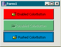
}That takes care of adding support for a glyph. The rest of TColorButton‘s methods are the same as before. Figure A depicts some TColorButton objects with glyphs.
Figure A: A few TColorButton objects with glyphs.
Recall from last time that the bulk of the code for the TColorButton class was for drawing the button’s face in its various states (e.g., normal, pushed, disabled, etc.). That code was placed within the DoDrawButtonFace() method, which drew a standard push button in a user-specified color. For some user interfaces, however, a standard push button might look awkward, even if the button is in a matching color. Although you could create a TColorButton descendant class and override the DoDrawButtonFace() method (in which you draw the button to match your UI), this route suffers from two major limitations: First, it’s a hassle, to say the least; and more importantly, depending on the complexity of your drawing code, it might be inefficient.
Suppose that you override the DoDrawButtonFace() method in a TColorButton descendant class; and within this method, you place some code to render a 3-D elliptic button that uses some fancy ray tracing. Although your code might be relatively fast, I argue that it’s probably not well suited for an owner-drawn button. Remember, the DoDrawButtonFace() method is called whenever the button receives the CN_DRAWITEM message. This message is sent whenever some aspect of the button needs to be redrawn. This means that your drawing code will be invoked each time the button is uncovered by another window, each time the button is pushed, each time the button’s Enabled property is changed, each time the button’s font is changed, etc. Unless your drawing code is extremely efficient, you’ll be using a fair number of CPU cycles, just to draw this one button.
Instead of calling your drawing code each time the button needs to be redrawn, it makes sense to call your code only once, storing the result in a bitmap object. Better still, there are a multitude of applications that can be used to create custom button images, why not use one of them? (ZPaint 1.4 is one such application; see www.steffengerlach.de/freeware/)
In the sections that follow, I’ll show you how to create a TColorButton descendant class—which I’ve called TBitmapButton—that allows you to specify the bitmaps that you want the button to use for its normal, pushed, and disabled faces.
Listing B contains the declaration of the TBitmapButton class, which extends the TColorButton class by providing three new properties: Faces, NumFaces, and NoFocusRect. These properties are supported via the private Faces_, NumFaces_, and NoFocusRect_ members, respectively. These members are initialized in the class constructor like so:
__fastcall TBitmapButton::
  TBitmapButton(TComponent* Owner)
    : TColorButton(Owner),
    NumFaces_(2), NoFocusRect_(false)
{
  Faces_ = new Graphics::TBitmap();
}
As I’ll discuss next, the Faces and NumFaces properties work just like the Glyph and NumGlyphs properties of the TSpeedButton class. The NoFocusRect_ member—which I’ll get to later—specifies whether the button should display a selection rectangle when it has keyboard focus. Here are the definitions of the SetFaces(), SetNumFaces(), and SetNoFocusRect() methods:
void __fastcall TBitmapButton::
  SetFaces(Graphics::TBitmap* Value)
{
  if (Faces_ != Value)
  {
    Faces_->Assign(Value);
    InvalidateRect(Handle, NULL, TRUE);
  }
}

void __fastcall TBitmapButton::
  SetNumFaces(int Value)
{
  if (NumFaces_ != Value)
  {
    NumFaces_ = Value;
    InvalidateRect(Handle, NULL, TRUE);
  }
}

void __fastcall TBitmapButton::
  SetNoFocusRect(bool Value)
{
  if (NoFocusRect_ != Value)
  {
    NoFocusRect_ = Value;
    InvalidateRect(Handle, NULL, FALSE);
  }
}The Faces property is a pointer to a TBitmap object that holds a composite image of the button’s faces in its normal, pushed, and disabled states (side-by-side, in that order; see Figure B). Accordingly, the NumFaces property specifies the number of faces that this bitmap contains. The NumFaces property is actually important because, when later you draw the button’s face, you’ll need to know which portion of Faces_ to render to match the button’s current state. Here’s the definition of the DoDrawButtonFace() method, which demonstrates how this is done:
void __fastcall TBitmapButton::
  DoDrawButtonFace(
    const TOwnerDrawState& state)
{
  // if no custom images have been set...
  if (Faces_->Empty)
  {
    // draw a normal push button
    TColorButton::
      DoDrawButtonFace(state);
  }
  // otherwise...
  else
  {
    TRect RSource = Rect(0, 0, 0, 0);

    // if the button is disabled
    if (!Enabled ||
        state.Contains(odDisabled))
    {
      switch (NumFaces_)
      {
        case 1:
        {
          RSource = Rect(
            0, 0, Faces_->Width,
            Faces_->Height);
          break;
        }
        case 2:
        {
          RSource = Rect(
            0, 0, Faces_->Width / 2,
            Faces_->Height);
          break;
        }
        case 3:
        {
          RSource = Rect(
            2 * Faces_->Width / 3, 0,
            Faces_->Width, Faces_->Height
            );
          break;
        }
      }
    }
    // otherwise, if the button is pushed
    else if (state.Contains(odSelected))
    {
      switch (NumFaces_)
      {
        case 1:
        {
          RSource = Rect(
            0, 0, Faces_->Width,
            Faces_->Height);
          break;
        }
        case 2:
        {
          RSource = Rect(
            Faces_->Width / 2, 0,
            Faces_->Width,Faces_->Height
            );
          break;
        }
        case 3:
        {
          RSource = Rect(
            Faces_->Width / 3, 0,
            2 * Faces_->Width / 3,
            Faces_->Height);
          break;
        }
      }
    }
    // otherwise (if normal)
    else
    {
      RSource = Rect(
        0, 0, Faces_->Width / NumFaces_,
        Faces_->Height);
    }

    // preserve colors
    SetStretchBltMode(
      Canvas->Handle, COLORONCOLOR);
    // render the face
    Canvas->CopyRect(ClientRect,
      Faces_->Canvas, RSource);
  }
}
Notice that the bulk of this code serves to define the local RSource variable, which is later passed to the TCanvas::CopyRect() method to specify which portion of Faces_ to draw. As I just mentioned, this portion depends on the number of face images (NumFaces_) that the composite bitmap (Faces_) contains.
Figure B depicts a few TBitmapButton objects along with the bitmap that defines each button’s faces (placed in a TImage object next to each button). Because the face-image of the first button (BitmapButton1) contains only one image, BitmapButton1’s NumGlyphs property is set to 1. Likewise, NumGlyphs is set to 2 and 3, respectively, for BitmapButton2 and BitmapButton3.
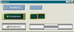
Figure B: Three TBitmapButton objects with custom bitmap faces.
You might have noticed from Figure B that the second button (BitmapButton2) uses a face-image that conflicts with the standard selection rectangle. In cases like this, you’d probably want to prevent the selection rectangle from being drawn; this is where the NoFocusRect property comes into play.
Recall from the definition of the TColorButton::DoDrawButtonText() method that the selection rectangle is rendered (if the button has keyboard focus) after the button’s caption is drawn. To suppress this selection rectangle, you simply augment the DoDrawButtonText() method and remove the odFocused enumerator, like so:
void __fastcall TBitmapButton::
  DoDrawButtonText(
    const TOwnerDrawState& state)
{
  // draw the caption...
  TOwnerDrawState new_state(state);
  TColorButton::DoDrawButtonText(
    NoFocusRect_ ?
    new_state >> odFocused : new_state);
}There’s one method of the TBitmapButton class that I haven’t mentioned yet: GetPalette(). The GetPalette() method is first introduced in the TControl class. By overriding this method, a descendant class can punt the palette-related work to the TControl class, which will ensure that—on displays that support only 256 or fewer colors—the system palette will be modified appropriately when your application is displayed. Here’s the code for the GetPalette() method, which simply returns a handle to the logical palette that the Faces_ bitmap uses (if any):
HPALETTE __fastcall TBitmapButton::
  GetPalette()
{
  if (!Faces_->Empty)
  {
    return Faces_->Palette;
  }
  return TColorButton::GetPalette();
}There are a few things that you might want to add to the TColorButton and TBitmapButton classes. Specifically, if you need to place the button’s glyph at a location other than the left side of the text, you’ll need to modify the TColorButton::DoDrawButtonGlyph() and DoDrawButtonText() methods accordingly. Also, you might want to extend the TBitmapButton::DoDrawButtonFace() method to support a fourth face that would be used when the button’s Default property is true. In addition, you’ll likely want to use the TCustomImageList::RegisterChanges() method in order to receive a notification when the underlying image list of the button’s Glyphs_ property is modified. Lastly, I encourage you to add a few events—such as OnDrawFace, OnDrawGlyph, OnDrawText, and OnPostDraw—that can be used to further tailor the appearance of the button on a per-instance basis. You never know what type of customization may be required in the future; these events will save a great deal of work farther down the road.
I’ve shown you how to create a button component that supports a glyph and a custom face-image. In fact, by using a separate image to define the button’s face, the TBitmapButton component will conform to most any user interface. You can even provide separate image-sets (i.e., skins) that your application can load at run time to allow your users to change the look of the UI. (The code that accompanies this article—available at www.bridgespublishing.com—demonstrates this process; Figure C depicts the sample application.) Next month, I’ll show you how to use a GDI region object to give your button a custom shape.
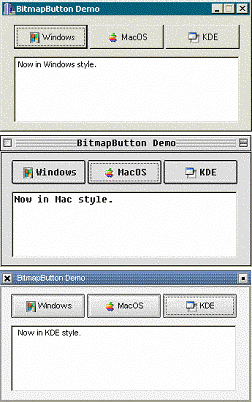
Figure C: Sample application in Windows, MacOS, and KDE modes.
Listing A: Declaration of the modified TColorButton class
#include <memory>
class PACKAGE TColorButton : public TButton
{
public:
  __fastcall TColorButton(TComponent* Owner);
  __property TCanvas* Canvas = {read = GetCanvas};

__published:
  __property TColor Color =
    {read = GetColor, write = SetColor};
  __property TColor ColorLo =
    {read = ColorLo_, write = SetColorLo,
     default = clBtnShadow};
  __property TColor ColorHi =
    {read = ColorHi_, write = SetColorHi,
     default = clBtnHighlight};
  __property int GlyphIndex =
    {read = GlyphIndex_, write = SetGlyphIndex};
  __property TImageList* Glyphs =
    {read = Glyphs_, write = SetGlyphs};

protected:
  // inherited methods
  virtual void __fastcall CreateParams(
    TCreateParams& Params);
  virtual void __fastcall SetButtonStyle(
    bool ADefault);

  // introduced methods
  virtual void __fastcall DoDrawButtonFace(
    const TOwnerDrawState& state);
  virtual void __fastcall DoDrawButtonText(
    const TOwnerDrawState& state);
  virtual void __fastcall DoDrawButtonGlyph(
    const TOwnerDrawState& state);

private:
  TColor ColorLo_;
  TColor ColorHi_;
  std::auto_ptr<TCanvas> Canvas_;
  bool draw_as_default_;
  int GlyphIndex_;
  TImageList* Glyphs_;

  TCanvas* __fastcall GetCanvas();
  TColor __fastcall GetColor();
  void __fastcall SetColor(TColor Value);
  void __fastcall SetColorLo(TColor Value);
  void __fastcall SetColorHi(TColor Value);
  void __fastcall SetGlyphIndex(int Value);
  void __fastcall SetGlyphs(TImageList* Value);

  MESSAGE void __fastcall CNDrawItem(
    TMessage& Msg);
  MESSAGE void __fastcall WMLButtonDblClk(
    TMessage& Msg);
  MESSAGE void __fastcall CMFontChanged(
    TMessage& Msg);
  MESSAGE void __fastcall CMEnabledChanged(
    TMessage& Msg);

public:
BEGIN_MESSAGE_MAP
  MESSAGE_HANDLER(
    CN_DRAWITEM, TMessage, CNDrawItem)
  MESSAGE_HANDLER(
    WM_LBUTTONDBLCLK, TMessage, WMLButtonDblClk)
  MESSAGE_HANDLER(
    CM_FONTCHANGED, TMessage, CMFontChanged)
  MESSAGE_HANDLER(
    CM_ENABLEDCHANGED, TMessage, CMEnabledChanged)
END_MESSAGE_MAP(TButton)
};
Listing B: Declaration of the TBitmapButton class
class PACKAGE TBitmapButton : public TColorButton
{
public:
  __fastcall TBitmapButton(TComponent* Owner);
  __fastcall ~TBitmapButton();

__published:
  __property Graphics::TBitmap* Faces =
    {read = Faces_, write = SetFaces};
  __property int NumFaces =
    {read = NumFaces_, write = SetNumFaces};
  __property bool NoFocusRect =
    {read = NoFocusRect_, write = SetNoFocusRect};

protected:
  DYNAMIC HPALETTE __fastcall GetPalette();
  virtual void __fastcall DoDrawButtonFace(
    const TOwnerDrawState& state);
  virtual void __fastcall DoDrawButtonText(
    const TOwnerDrawState& state);

private:
  Graphics::TBitmap* Faces_;
  int NumFaces_;
  bool NoFocusRect_;

  void __fastcall SetFaces(
    Graphics::TBitmap* Value);
  void __fastcall SetNumFaces(int Value);
  void __fastcall SetNoFocusRect(bool Value);
};