Expandable dialog boxes can be useful for selectively displaying information to users. In its normal state an expandable dialog box will display a limited amount of information or controls to the user. When the dialog box is expanded, more information or controls are displayed.
Microsoft uses the term Modal Unfolding Secondary Window to describe and expandable dialog box. This use of the word unfolding is meant to emphasize the fact that the dialog is not resizable in the normal Windows way. The expandable dialog only has two sizes normal (folded) and expanded (unfolded).
Normally, an unfold button is used to fold and unfold the dialog. Microsoft recommends appending two “greater than” characters (>>) to the button’s label to indicate that the dialog can be unfolded. Two “lesser than” characters are appended to the button’s label to show that the dialog has been expanded and that clicking in the button will fold the dialog back to its normal state.
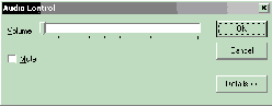
Figure A shows an expandable dialog box in its normal state, with many of the dialog’s controls hidden. The dialog can be expanded or unfolded by clicking on the “Details” button.
Figure A
Expandable dialog in its normal state
Figure B shows the same dialog box in its expanded state, with all of the dialog’s controls available to the user. The dialog can be returned to its normal or folded state by clicking on the “Details” button.
Figure B
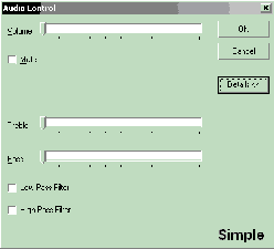
Expandable dialog in its expanded state
Using the VCL, building a simple expandable dialog turns out to be … well, simple. Most of the work can be done in the IDE by dropping a few components on a form and setting a few properties in the object inspector. We will only need to write a few lines of code.
Let’s start by creating a new application. Change the Name property of the form to “ExpandableDialog”. To turn the form into a dialog box, change the form’s BorderStyle property to bsDialog.
Next set the Height and Width properties to 360 and 400. This is the expanded size of the dialog.
Drop a TPanel component on the form and set its Align property to alTop. This panel defines the portion of the dialog that will be displayed in the normal or folded state. Clear the panel’s Caption property and set the BevelOuter property to bvNone. This makes the panel appear “invisible”. Finally, set the panels Height property to 167.
Now drop a second panel onto the form below the first panel. This panel will be the section of the dialog that appears when the dialog is expanded.
We’ll use a trick to place this panel. Set the panel’s Align property to alBottom. This will place the panel at the bottom of the form. Again, clear the panel’s Caption and set BevelOuter to bvNone. Now drag the top of this panel until it meets the bottom of the first panel.
We used the panel’s Align property to place the panel at the bottom of the form, but we don’t want the panel to always align with the form’s bottom, so set the Align property back to alNone.
Again, the top panel will hold the controls that will always be displayed in the dialog. The bottom panel will hold the controls that will only be display when the dialog is expanded.
Let’s finish up by placing three buttons vertically on the right side of the top panel. Change the Name of the top button to “OKBtn” and set its Caption property to “OK”. Also set its ModalResult property to mrOk.
The Name property of the middle button should be “CancelBtn” and its Caption should be “Cancel”. Set its ModalResult property to mrCancel and set its Cancel property to true.
The ModalResult property for the first two buttons does a couple of things. When this dialog is displayed using the ShowModal() method, these buttons will close the dialog and return the value of the ModalResult property of the button clicked. All this is done without having to write an OnClick handler for the buttons.
Setting the Cancel property to true for the middle button tells the VCL to act as if this button was clicked when the escape key is pressed on the keyboard.
The third button is the “unfold” button. We don’t need to make any changes to this button’s properties.
Now, let’s write a few lines of code. Listings A and B are the source code for this simple expandable dialog box.
If you’ll notice I’ve added a property called Expanded to the header file (Listing A). This does exactly what you think it does. Setting Expanded to true expands the dialog and setting it to false returns the dialog to its normal state.
This is accomplished in the SetExpanded() method. The trick this method uses is to make the lower panel, Panel2, visible or invisible and then forcing the dialog to resize by setting the dialog’s AutoSize property first to false and then to true.
The SetExpanded() method also takes care of setting the correct Caption for the unfold button.
The OnClick event of the unfold button simply reverses the value of the dialog’s Expanded property.
Finally, save the unit containing the dialog as “ExpandDlg.cpp”.
As it stands, you can run this application and the dialog will expand and contract. But it won’t do much else. So, how do we make this dialog useful?
To allow us to use the expandable dialog in any project, we are going to add it to the IDE’s Object Repository. The easiest way to do this is to right click on the dialog and choose “Add to repository…” from the menu. A dialog similar to the one in Figure C will appear.
Figure C
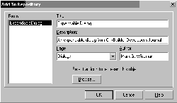
The Add To Repository dialog box
Fill in the fields with the appropriate information and click the OK button. Now we can use this dialog in any of our projects.
By the way, I looked it up in my dictionary and reposit really is a word.
Once the dialog has been placed in the Object Repository it very easy to include the dialog in you projects.
While working in the IDE on a project, just click on the File | New… menu item. Select the Dialogs tab and double click on the Expandable Dialog icon. The code and form for the expandable dialog are now in your project. Add the controls you want in the IDE’s designer, remembering to place them on the top or bottom panel, as your design requires.
There is a demonstration application on the Bridges Publishing web site that was written in just this way.
Creating a simple expandable dialog box was simple. But what if you want something more exciting and dynamic? What if you want a fancy expandable dialog box? If you do, then read my article, A fancy expandable dialog box, in this issue.
Listing A: ExpandDlg.h
#ifndef ExpandDlgH
#define ExpandDlgH

#include <Classes.hpp>
#include <Controls.hpp>
#include <StdCtrls.hpp>
#include <Forms.hpp>
#include <ExtCtrls.hpp>


class TExpandableDialog : public TForm
{
  __published:
    TPanel *Panel1;
    TPanel *Panel2;
    TButton *OKBtn;
    TButton *CancelBtn;
    TButton *DetailsBtn;
    void __fastcall DetailsBtnClick(
      TObject *Sender);

  public:
    __fastcall
      TExpandableDialog(TComponent* Owner);

    __property bool Expanded = {
       read = expanded,
       write = SetExpanded};

  private:
    void __fastcall SetExpanded(
      bool expand);

    bool expanded;
};


extern PACKAGE
  TExpandableDialog *ExpandableDialog;


#endif   // ExpandDlgH
Listing B: ExpandDlg.cpp
#include <vcl.h>
#pragma hdrstop

#include "ExpandDlg.h"

#pragma package(smart_init)
#pragma resource "*.dfm"

TExpandableDialog *ExpandableDialog;

__fastcall TExpandableDialog::TExpandableDialog(
  TComponent* Owner) : TForm(Owner)
{
  Expanded = false;
}

void __fastcall TExpandableDialog::
  DetailsBtnClick(TObject *Sender)
{
  Expanded = !Expanded;
}

void __fastcall TExpandableDialog::SetExpanded(
  bool expand)
{
  AutoSize = false;

  expanded = expand;
  Panel2->Visible = expanded;
  DetailsBtn->Caption = Expanded ?
    "&Details <<" : "&Details >>";

  AutoSize = true;
}