
If you have worked with the Visual Component Library (VCL) for long, you will have noticed that Borland has provided you with more than one type of button. There are components named TButton, TBitBtn and TSpeedButton.
In this article I’ll explain the differences between these components and give you some suggestions on when you might want to use one over the other. I’ll also touch briefly on TToolButton, the button used with the TToolBar component.
There is a demonstration program on the Bridges Publishing web site that will give you a good idea of how these components look and behave.
Before I talk about the difference between the VCL button components, I’d like to point out the similarities.
TButton, TBitBtn and TSpeedButton all have TControl as a common ancestor. This means that they share many properties and events. The Action, Hint and Caption properties are some of the more important properties shared by these components.
I’ll come back to the Action property after I discuss the OnClick event below. The Hint property contains the text string that can appear when the user moves the mouse over the button.
The Caption property contains the text that is displayed on the button’s face. Figure A shows a section of the demo program with a TButton, TBitBtn and TSpeedButton. Their respective captions are “Button1”, “BitBtn1” and “SpeedButton1”.
Figure A
TButton, TBitBtn and TSpeedButton components
The OnClick event is the most important of the shared events. Users click buttons to initiate events within a program. Most of the time you will use the OnClick event to respond to a button click. OnClick works exactly the same for all three types of button components. Here is an example of a function assigned to the OnClick event:
void __fastcall TMainForm::ButtonClick(
  TObject *Sender)
{
  TButton *button =
    dynamic_cast<TButton *>(Sender);
  if (button == 0) return;

  ShowMessage(button->Caption
    + " was clicked.");
}
If you assign an action to the Action property of a button, the action’s OnExecute event will be assigned to the button’s OnClick event. Several of the action’s other properties (e.g. Caption and Hint) will also be assigned to corresponding properties of the button.
TButton is the button component you will probably use the most. The TButton component is the VCL encapsulation of the standard Windows button and works just like a button that you would create using the Windows API. You place a TButton onto a form, give it a meaningful Caption and have it respond to user clicks.
As mentioned above, you could have the button respond to clicks by writing an OnClick event or it could respond through a TAction object.
The TBitBtn component is derived directly from TButton.
The TBitBtn component adds the ability to display glyphs or small bitmaps on the button’s face through several properties: Glyph, NumGlyphs, Layout, Margin, Spacing and Kind.
The Glyph property contains the glyphs to be displayed. If the Glyph property is empty, only the Caption text is displayed on the face.
A TBitBtn can have three states: up, down, and disabled. You can have the TBitBtn display a different bitmap for each state. If you provide only one bitmap, TBitBtn will use it for the up and down states and will alter it (gray it) for the disabled state.
You can only assign one bitmap to the Glyph property, but that bitmap can contain one to four sections. The fourth section is unused by TBitBtn but can be used by TSpeedButton (see below). The NumGlyphs property should be set to the number of sections in the bitmap.
Figure B shows the bitmap used in the demonstration program, and defines its four sections. My total lack of artistic skills forced me to use text in the bitmap, but you can still see how it’s used.
Figure B

A bitmap assigned to the Glyph property of TBitBtn and TSpeedButton
The Layout property determines whether the glyph is displayed on the left, right, top or bottom of the button’s text. Figure C shows the four positions and corresponding value of Layout.
Figure C
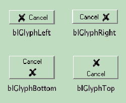
Effects of the Layout property
The Margin property of TBitBtn determines the number of pixels between the glyph and the edge of the button. For instance, if the Layout property is set to blGlyphLeft and the Margin property is set to 10, then the glyph’s left edge will be 10 pixels from the buttons left edge. If Margin is set to -1, the glyph and caption text will be centered on the button face.
The Spacing property is the number of pixels between the glyph and the caption text. By default, the two are separated by 4 pixels.
The Kind property will save you a lot of work. Borland has incorporated ten commonly used glyphs and captions, such as those for the OK and Cancel buttons used in the demonstration program. Using the built in glyphs will relieve you from having to create them.
Setting the Kind property of a TBitBtn object to bkOK will cause the button to use an internal glyph of a checkmark and the caption of “OK”. It also sets the button’s ModalResult property to the corresponding value.
There is one more thing I should point out about TBitBtn. If you leave the button’s Caption property empty, then only the glyph will be displayed. This is also true of the next VCL button component I’ll discuss, TSpeedButton.
The TSpeedButton component was originally meant to be used when building tool bars from TPanel objects. Before Borland added the TToolBar component, using a TPanel object as a tool bar was a fairly common practice.
To save Windows resources, in particular window handles, Borland created the TSpeedButton component. Unlike TButton and TBitBtn, which are derived from TWinControl, TSpeedButton is derived from TGraphicControl. TGraphicControl does not use a window handle like TWinControl does. So, TSpeedButton is very resource efficient.
Unfortunately, this efficiency comes at a price. Since TSpeedButton has no window handle, it cannot receive the keyboard focus. This means you cannot tab to the button and press it by hitting Enter on the keyboard.
There are some neat features to TSpeedButton though. Just like TBitBtn, TSpeedButton can use glyphs. However, TSpeedButton adds a fourth state and thus can use four different glyphs; one more than TBitBtn.
The fourth state supported by TSpeedButton is the keep down state. The button is depressed when you click on it with the left mouse button and it stays depressed. Click it again with the left mouse button and the TSpeedButton goes back to the up state. Using this feature you can create TSpeedButton objects that act like check boxes and radio buttons.
Figure D shows a section of the demo program where three TSpeedButton objects are set to behave like radio buttons. In this example, the top button is depressed and the other two are not. If you click on the middle or bottom button, then that button would then remain depressed and the top button would return to its up position.
Figure D
TspeedButtons used as radio buttons.
It’s easy to make TSpeedButton objects act as radio buttons. In the example above, I put three TSpeedButton objects on a form and set the GroupIndex property to 1 for each of the objects. There is no significance to using the value of 1. The only thing that matters is that all of the buttons in a “radio group” have the same GroupIndex value. I also made sure that the AllowAllUp property of each of the objects was set to false. This tells the objects that one of them must always be depressed. At design time, you can choose the button that starts off depressed by setting its Down property to true.
To make a single TSpeedButton object act like a check box, set its GroupIndex to a value (other than zero) that is not used by any other TSpeedButton. Then set the AllowAllUp property to true.
Setting the GroupIndex property to zero tells the TSpeedButton to act like a normal button.
There is one more property of TSpeedButton I’d like to mention. The Flat property, when set to true, causes the button to be drawn flat, unless the mouse is over it. When the mouse does pass over the button, it rises up to take on the appearance of a normal button.
I wanted to briefly discuss TToolButton since in a way it replaces TSpeedButton in TSpeedButton’s original function. TToolButton objects can only be created in TToolBar objects and the TToolBar object is really too complicated to explain in this article. Just be aware that if you want to create a tool bar with buttons that you will probably want to use a TToolBar and TToolButtons.
There are a lot of third-party button components available. Some of them give you shapes other than rectangular. You can have round buttons or even triangular buttons. Other button components have animated glyphs. Still others have multiple states—more states than only up or down.
If you have a need for a specialized button component, someone has probably already created one you can use.
So, which button component should you use? Here are some guidelines you should consider.
First, if you want a standard Windows button, then use TButton. It is a standard Windows button.
If you need to add a glyph to a button, use TBitBtn. If you used TSpeedButton, you would force users to use the mouse since TSpeedButton cannot receive keyboard focus. Your users might not appreciate this.
There are a couple of times when you might consider using TSpeedButton. The first is when you need to create a toolbar that you can’t create using the TToolBar component.
The second is when you need to have a lot of buttons in a single window. A good example of this would be a scientific calculator. Using TSpeedButton would save a lot of Windows resources and the need for keyboard focus could be met by assigning the numeric keypad to the numerals and arithmetic functions.
I hope that I have given you a better feel for the different types of button components included in the VCL and for when you might use each of them.