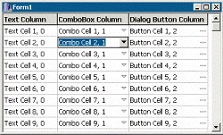
Several months ago, I presented a technique for creating custom popup controls. And, several months prior to that, I demonstrated how to customize the appearance of a string grid. In this series of articles, I’ll show you how to use these two techniques to add controls—such as a combo box—to the cells of a string grid. Figure A depicts an example.
Figure A
A TStringGrid object with customized cells.
This month, we’ll work through an example of creating of the string grid depicted in Figure A. The first column contains "regular" cells—that is, cells that display just text. The second column contains cells that display a combo box. The third column contains cells that display a button that launches a dialog box.
The TForm1 class for this example is declared in Listing A. Form1 contains only a single control (StringGrid1), and one private member (BtnDown_) whose role I’ll discuss later. The project also contains two other forms: a TPopupForm descendant (PopupListBox; see Listing D), and a generic dialog box form (DialogForm). (See the article "Custom popup controls" for the definition of the TPopupForm class.)
For this example, we have three types of cells: cells that contain text, cells that contain a combo box, and cells that contain a button. Accordingly, we’ll need to associate data with the cells in order to store (and later retrieve) what control (if any) each cell contains. For this, we’ll use the TStringGrid::Objects property, which is defined like so:
__property TObject*
  Objects[int ACol][int ARow] =
  {read=GetObjects, write=SetObjects};
Notice that the Objects property is used just like the Cells property; but, whereas the Cells property holds an AnsiString, the Objects property holds a pointer to a TObject. Listing B contains the definition of the TObject descendant class—TCellObject—that we’ll use with the Objects property.
The TCellObject class is a bare-bones implementation of a class that can identify and interact with the information contained in each cell for this example. The TCellObject::Type property specifies the type of cell: ctText for a normal cell, ctCombo for a cell that contains a combo box, and ctDialog for cell that contains a button. I’ve also added properties called Text, Col, and Row, which are self-explanatory.
Before we associate a TCellObject–type object with each cell, let’s define a couple of utility functions to retrieve the object held in each cell. These functions will eliminate the hassle of constantly casting the return value of the Objects property from TObject to TCellObject. Here’s the code:
TCellObject* CellData(
  TStringGrid& Grid, int col, int row)
{
  if (col == -1 || row == -1 ||
      col >= Grid.ColCount ||
      row >= Grid.RowCount)
  {
    return NULL;
  }
  return static_cast<TCellObject*>(
    Grid.Objects[col][row]);
}

TCellObject* CellData(
  TStringGrid& Grid, TPoint P)
{
  int col, row;
  Grid.MouseToCell(P.x, P.y, col, row);
  if (col == -1 || row == -1 ||
      col >= Grid.ColCount ||
      row >= Grid.RowCount)
  {
    return NULL;
  }
  return static_cast<TCellObject*>(
    Grid.Objects[col][row]);
}
Both versions of the CellData() function return either a pointer to a TCellObject–type object or NULL, depending on whether or not the target cell is valid. In the first version of the CellData() function, the target cell is specified via column and row indices (col and row). In the second version of CellData(), the target cell is specified implicitly; the TPoint-type parameter (P) specifies the location of the cell in pixel-based coordinates (relative to the client area of the string grid).
Now that the basic groundwork is set, let’s associate a TCellObject-type object with each cell. We’ll do this in the TForm1 constructor, like so:
__fastcall TForm1::
  TForm1(TComponent* Owner)
    : TForm(Owner), BtnDown_(false)
{
  const int r_min =
    StringGrid1->FixedRows;
  const int r_max =
    StringGrid1->RowCount;

  StringGrid1->Cells[0][0] =
    "Text Column";
  StringGrid1->Cells[1][0] =
    "ComboBox Column";
  StringGrid1->Cells[2][0] =
    "Dialog Button Column";

  for (int r = r_min; r < r_max; ++r)
  {
    // first column
    TCellObject* pData =
      new TCellObject(StringGrid1,0,r);
    pData->Type = TCellObject::ctText;
    pData->Text = "Text Cell (" +
      IntToStr(r) + ", 0)";

    // second column
    pData =
      new TCellObject(StringGrid1,1,r);
    pData->Type = TCellObject::ctCombo;
    pData->Text = "Combo Cell (" +
      IntToStr(r) + ", 1)";

    // third column
    pData =
      new TCellObject(StringGrid1,2,r);
    pData->Type = TCellObject::ctDialog;
    pData->Text = "Button Cell (" +
      IntToStr(r) + ", 2)";
  }
}
Notice from Listing B that the TCellObject class will automatically associate itself with the cell that’s specified via the Grid, Col, and Row parameters of the TCellObject constructor. As a result, we need only create a TCellObject-type object and pass its constructor the appropriate parameters; there’s no need to access the string grid’s Objects property directly.
Again, cells of the first column will contain just text; accordingly, so we set the TCellObject::Type property to ctText for these cells. Likewise, we set the Type property to ctCombo and ctDialog for cells of the second and third columns, respectively.
Unfortunately, the string grid won’t automatically delete the objects specified in its Objects property. Therefore, we’ll delete each object manually in the TForm1 destructor:
__fastcall TForm1::~TForm1()
{
  const int r_min =
    StringGrid1->FixedRows;
  const int r_max =
    StringGrid1->RowCount;

  for (int r = r_min; r < r_max; ++r)
  {
    delete CellData(*StringGrid1, 2, r);
    delete CellData(*StringGrid1, 1, r);
    delete CellData(*StringGrid1, 0, r);
  }
}Now that each cell has an object associated with it, we can use the TCellObject::Type property to determine what type of control (if any) the cell should contain. Namely, if Type is ctCombo, then the cell should contain a combo box; and if Type is ctDialog, then the cell should contain a button.
Of course, merely associating a TCellObject-type object with each cell won’t automatically place the appropriate control in each cell; this task we’ll need to do manually.
Unfortunately, several factors preclude placing a TComboBox object or a TButton object within each cell. One problem is that the string grid won’t automatically move these controls when the grid is scrolled. Another problem is that—depending on the number of cells—a combo box or a button in each cell will consume a huge number of window handles (and thus system resources). Furthermore, adding so many controls to the string grid will likely make the grid appear too cluttered—notice from Figure A that only the focused cell has the control drawn in 3-D; the other cells display only an indicator glyph.
In the previous string grid article (see "More string grids" in the October 2000 issue), I showed you how to use the DrawFrameControl() function with the TStringGrid::OnDrawCell event to render a check box in each cell. We can use a similar approach here. Specifically, instead of placing a combo box or a button in each cell, we can render these controls manually from within StringGrid1’s OnDrawCell event handler. Here’s the code for that:
void __fastcall TForm1::
  StringGrid1DrawCell(TObject *Sender,
    int ACol, int ARow, TRect &ARect,
    TGridDrawState State)
{
  TStringGrid& Grid =
    static_cast<TStringGrid&>(*Sender);
  TCanvas& SGCanvas = *Grid.Canvas;
  SGCanvas.Font = Grid.Font;
  RECT RText = ARect;

  // if the cell is fixed (header)
  if (State.Contains(gdFixed))
  {
    SGCanvas.Brush->Color =
      Grid.FixedColor;
    SGCanvas.FillRect(ARect);
    Frame3D(&SGCanvas, ARect,
      clBtnHighlight, clBtnShadow, 1);

    SGCanvas.Font->Style =
      SGCanvas.Font->Style << fsBold;
  }
  // if the cell is not a fixed cell
  else
  {
    SGCanvas.Brush->Color = Grid.Color;
    SGCanvas.FillRect(ARect);

    const TCellObject* pData =
      CellData(Grid, ACol, ARow);
    if (pData->Type !=
      TCellObject::ctText)
    {
      // make room for the button
      RText.right -= 18;

      // draw the combo-box or button
      DrawCellControl(SGCanvas, ARect,
        pData->Type, State, BtnDown_);
    }

    // if the cell is focused
    if (State.Contains(gdFocused))
    {
      //
      // render a black outline
      // (or use DrawFocusRect() if you
      // prefer a classic focus rect.)
      //
      SGCanvas.Pen->Color = clBlack;
      SGCanvas.Brush->Style = bsClear;
      SGCanvas.Rectangle(ARect);
      SGCanvas.Brush->Style = bsSolid;
    }

    bool selected =
      State.Contains(gdSelected);
    if (Grid.Options.
      Contains(goDrawFocusSelected))
    {
      selected = selected &&
        !State.Contains(gdFocused);
    }
    // if the cell is selected
    if (selected)
    {
      SGCanvas.Font->Color =
        clHighlightText;
      SGCanvas.Brush->Color =
        clHighlight;
    }
  }

  // draw the text
  RText.left += 2;
  RText.right -= 2;
  DrawText(
    SGCanvas.Handle,
    Grid.Cells[ACol][ARow].c_str(),
    -1, &RText, DT_LEFT |
    DT_SINGLELINE | DT_VCENTER
    );
}
This code is similar to the OnDrawCell event handler that I provided in the previous string grid article. The main difference here is that I’ve added code to draw a control within each cell if that cell’s TCellObject-type object says to do so (i.e., if Type is ctCombo or ctDialog). This task is done by first calling the CellData() function to retrieve a pointer to the TCellObject-type object that’s associated with the current ("to-be-drawn" cell). Then, the TCellObject::Type property’s value is passed to the DrawCellControl() function to render the appropriate control.
The DrawCellControl() function renders either a combo-box scroll button (i.e., the drop-down button) or a button with an ellipsis (indicating that a dialog will be shown). Here’s how the function is defined:
void DrawCellControl(
  TCanvas& Canvas, TRect& RCell,
  TCellObject::TCellType Type,
  TGridDrawState State, bool BtnDown)
{
  const TColor old_bsh_color =
    Canvas.Brush->Color;
  const TColor old_pen_color =
    Canvas.Pen->Color;
  try {
    Canvas.Brush->Color = clBtnFace;
    if (State.Contains(gdFocused))
    {
      TRect RBtn = RCell;
      RBtn.Left = RBtn.Right - 18;
      Canvas.FillRect(RBtn);

      if (BtnDown)
      {
        Frame3D(&Canvas,
          RBtn, clBtnShadow,
          clBtnHighlight, 1);
      }
      else
      {
        Frame3D(&Canvas,
          RBtn, clBtnHighlight,
          clBtnShadow, 2);
      }
      Canvas.Pen->Color = clBlack;
      Canvas.Brush->Color = clBlack;
    }
    else Canvas.Pen->Color =clBtnShadow;

    //
    // draw the combo box scroll arrow
    // or the dialog button ellipsis...
    //
    TRect RBtn = RCell;
    RBtn.Left = RBtn.Right - 18;
    if (Type == TCellObject::ctCombo)
    {
      TPoint Ps[3];
      Ps[0].x = RBtn.left - 4 +
        0.5 * (RBtn.right - RBtn.left);
      Ps[0].y = RBtn.top - 3 +
        0.5 * (RBtn.bottom - RBtn.top);
      if (BtnDown &&
        State.Contains(gdFocused))
      {
        Ps[0].y += 1;
      }

      Ps[1].x = Ps[0].x + 8;
      Ps[1].y = Ps[0].y;
      Ps[2].x = Ps[0].x + 4;
      Ps[2].y = Ps[0].y + 4;

      // draw the arrow
      Canvas.Polygon(Ps, 2);
    }
    else if (Type ==
      TCellObject::ctDialog)
    {
      TPoint P = Point(
        RBtn.left + 2, RBtn.top - 1 +
        0.5 * (RBtn.bottom - RBtn.top));
      if (BtnDown &&
        State.Contains(gdFocused))
      {
        P.y += 1;
      }

      // draw the ellipsis
      Canvas.Ellipse(P.x + 2, P.y,
        P.x + 5, P.y + 3);
      Canvas.Ellipse(P.x + 6, P.y,
        P.x + 9, P.y + 3);
      Canvas.Ellipse(P.x + 10, P.y,
        P.x + 13, P.y + 3);
    }
  }
  __finally {
    Canvas.Pen->Color = old_pen_color;
    Canvas.Brush->Color = old_bsh_color;
  }
}
The Canvas parameter specifies to which canvas the control should be drawn. The RCell parameter specifies the target cell’s bounding rectangle. The Type parameter specifies the type of control to be drawn (ctCombo or ctDialog). The BtnDown parameter specifies whether the combo-box button or dialog button should be drawn in a pushed state. And, the State parameter specifies the state of the target cell. If the cell is focused, the control is drawn in 3-D; otherwise, only the arrow or ellipsis is rendered (see Figure A).
At this point, we’ve done much of the work toward creating the string grid of Figure A. We have a string grid that will display either a combo box or an ellipsis button within each cell. Now it’s time to provide functionality for these controls.
I just mentioned that the BtnDown parameter of the DrawCellControl() function specifies whether or not the button should be drawn as pushed. Furthermore, notice from the StringGrid1DrawCell() member function that the private BtnDown_ member is passed as DrawCellControl()‘s BtnDown parameter. Consequently, in order to make each button "clickable," we’ll need to toggle the BtnDown_ member whenever the user clicks the cell’s button. For this, we’ll use the string grid’s OnMouseDown event handler, like so:
void __fastcall TForm1::
  StringGrid1MouseDown(TObject *Sender,
    TMouseButton Button, TShiftState,
    int X, int Y)
{
  if (Button != mbLeft) return;

  TStringGrid& Grid =
    static_cast<TStringGrid&>(*Sender);
  const TCellObject* pData =
    CellData(Grid, Point(X, Y));
  if (!pData) return;

  BtnDown_ = PtInBtn(Grid, X, Y);
  if (BtnDown_)
  {
    // draw the button as pushed
    RedrawBtn(
      Grid, pData->Col, pData->Row);
  }

  if (pData->Type ==
    TCellObject::ctCombo)
  {
    // show the popup window
    RECT RCell;
    CellRectFromPt(
      *StringGrid1, X, Y, RCell);

    PopupListBox->Left = RCell.left;
    PopupListBox->Top = RCell.bottom;
    PopupListBox->Width = max(
      RCell.right - RCell.left, 50L
      );
    PopupListBox->Grid = StringGrid1;
    //
    // add/remove items from
    // PopupListBox->ListBox
    // as needed...
    //
    PopupListBox->Show();
  }
  else if (pData->Type ==
    TCellObject::ctDialog)
  {
    // defer launching the dialog until
    // the mouse button is released
  }
}
Here, we first grab a pointer to the "clicked" cell’s TCellObject-type object by using the version of the CellData() function that takes pixel-based coordinates (X and Y). We then use the PtInBtn() utility function (provided in Listing C) to determine whether or not the "clicked" point is within a cell’s combo-box button or dialog button. If so, the cell’s button is redrawn in the pushed state via the RedrawBtn() utility function (see Listing C).
Notice from this code that if the "clicked" cell is of type ctCombo, we determine the screen coordinates of the cell via the CellRectFromPt() utility function (see Listing C), and then we position and show the popup list box (i.e., the drop-down list of the combo box). I won’t discuss the specifics of the popup list box, but I’ve provided its definition in Listing D. (See the article "Custom popup controls" in the May 2001 issue for more information on popup controls.)
If the "clicked" cell is of type ctDialog, we’ll launch the dialog when and if the user releases the mouse button within the bounds of the cell’s button. We can test for this condition from within the string grid’s OnMouseUp event handler, like so:
void __fastcall TForm1::
  StringGrid1MouseUp(TObject *Sender,
    TMouseButton Btn, TShiftState Shift,
    int X, int Y)
{
  if (Btn != mbLeft || !BtnDown_)
    return;

  TStringGrid& Grid =
    static_cast<TStringGrid&>(*Sender);

  // draw the button as unpushed
  BtnDown_ = false;
  RedrawBtn(Grid, Grid.Col, Grid.Row);

  if (PtInBtn(Grid, X, Y))
  {
    const TCellObject* pData =
      CellData(Grid, Point(X, Y));

    if (pData->Type ==
      TCellObject::ctDialog)
    {
      // show the dialog
      DialogForm->ShowModal();

      //
      // adjust the cell's text
      // accordingly...
      //
    }
  }
}
Observe that two main tasks are performed within the OnMouseUp event handler: (1) the focused cell’s button is redrawn in the un-pushed state; and (2) the dialog (DialogForm) is launched only if the mouse button is released while the cursor is over the button.
After the combo box or dialog is closed, how you adjust the cell is up to you. Notice from the TPopupListBox:: ListBoxMouseUp() member function of Listing D that the TPopupListBox class will automatically change the cell’s text (via the TStringGrid::Cells property) according to which list box item the user selected. Depending on what you design DialogForm to do, you can use a similar approach when the dialog is closed.
In this article, I’ve demonstrated the basics of adding a combo box and a button to the cells of a string grid; and, I’ve shown you how to interact with these controls. (Actually, I’ve demonstrated only mouse-based interaction; I’ll leave the keyboard-related code up to you). You can download the full code for this example at www.bridgespublishing.com.
Next month, I’ll provide a more object-oriented approach to customization. I’ll demonstrate how to create a TStringGrid descendant class with generic control-rendering functionality (e.g., an OnDrawControl event), and I’ll show you how to customize the grid’s in-place editor.
Listing A: Declaration of the TForm1 class
class TForm1 : public TForm
{
__published:
  TStringGrid* StringGrid1;
  void __fastcall StringGrid1DrawCell(
    TObject* Sender, int ACol, int ARow,
    TRect &Rect, TGridDrawState State);
  void __fastcall StringGrid1MouseDown(
    TObject* Sender, TMouseButton Button,
    TShiftState Shift, int X, int Y);
  void __fastcall StringGrid1MouseUp(
    TObject* Sender, TMouseButton Button,
    TShiftState Shift, int X, int Y);

private:
  bool BtnDown_;

public:
   __fastcall TForm1(TComponent* Owner);
   __fastcall ~TForm1();
};
Listing B: Definition of the TCellObject class
#include <cassert>
#include <Grids.hpp>
class TCellObject : public TObject
{
public:
  enum TCellType {ctText, ctCombo, ctDialog};

  __property TCellType Type =
    {read = Type_, write = DoSetType};
  __property AnsiString Text =
    {read = DoGetText, write = DoSetText};
  __property int Col = {read = Col_};
  __property int Row = {read = Row_};

public:
  __fastcall TCellObject(TStringGrid* Grid,
     int Col, int Row) : TObject(), Grid_(Grid),
     Row_(Row), Col_(Col), Type_(ctText)
    {
      assert(Grid_ != NULL);
      Grid_->Objects[Col_][Row_] = this;
    }

protected:
  virtual void __fastcall DoSetType(
    TCellType NewType)
    {
      if (Type_ != NewType)
      {
        Grid_->Objects[Col_][Row_] = this;
        Type_ = NewType;
      }
    }
  virtual AnsiString __fastcall DoGetText()
    {
      return Grid_->Cells[Col_][Row_];
    }
  virtual void __fastcall DoSetText(
    AnsiString NewText)
    {
      Grid_->Cells[Col_][Row_] = NewText;
    }

private:
  TStringGrid* Grid_;
  TCellType Type_;
  int Col_, Row_;
};
Listing C: Various string-grid-related utility functions
void RedrawBtn(
  TStringGrid& Grid, int col, int row)
{
  RECT RBtn = Grid.CellRect(col, row);
  RBtn.left = RBtn.right - 18;

  RedrawWindow(
    Grid.Handle, &RBtn, NULL,
    RDW_INVALIDATE | RDW_UPDATENOW
    );
}

bool PtInBtn(TStringGrid& Grid, int X, int Y)
{
  int col, row;
  Grid.MouseToCell(X, Y, col, row);
  if (col != -1 && row != -1)
  {
    const POINT PMouse = {X, Y};
    RECT RBtn = Grid.CellRect(col, row);
    RBtn.left = RBtn.right - 18;

    return PtInRect(&RBtn, PMouse);
  }
  return false;
}

void CellRectFromPt(
  TStringGrid& Grid, int X, int Y, RECT& RCell)
{
  int col, row;
  Grid.MouseToCell(X, Y, col, row);
  if (col != -1 && row != -1)
  {
    RCell = Grid.CellRect(col, row);
    MapWindowPoints(
      Grid.Handle, HWND_DESKTOP,
      reinterpret_cast<POINT*>(&RCell), 2);
  }
  else SetRectEmpty(&RCell);
}
Listing D: The TPopupListBox class
#include "POPUPFORMUNIT.h"
class TPopupListBox : public TPopupForm
{
__published:
  TListBox *ListBox;
  void __fastcall ListBoxMouseMove(TObject *Sender,
    TShiftState Shift, int X, int Y);
  void __fastcall ListBoxMouseUp(TObject *Sender,
    TMouseButton Button, TShiftState Shift,
    int X, int Y);

private:
  TStringGrid* Grid_;

public:
  __fastcall TPopupListBox(TComponent* Owner)
    : TPopupForm(Owner) {}
  __property TStringGrid* Grid =
    {read = Grid_, write = Grid_};
};

void __fastcall TPopupListBox::
  ListBoxMouseMove(TObject *Sender,
    TShiftState Shift, int X, int Y)
{
  if (Shift.Contains(ssLeft))
  {
    if (Grid_ != NULL)
    {
      POINT PMouse = {X, Y};
      MapWindowPoints(ListBox->Handle,
        Grid_->Handle, &PMouse, 1);

      RECT RBtn =
        Grid_->CellRect(Grid_->Col, Grid_->Row);
      RBtn.left = RBtn.right - 18;
      if (!PtInRect(&RBtn, PMouse))
      {
        PostMessage(
          Grid_->Handle, WM_LBUTTONUP, 0, 0);
      }
    }
  }

  const int hit_index =
    ListBox->ItemAtPos(Point(X, Y), false);
  if (hit_index != -1)
  {
    ListBox->ItemIndex = hit_index;
  }
}

void __fastcall TPopupListBox::
  ListBoxMouseUp(TObject *Sender,
    TMouseButton Btn, TShiftState Shift,
    int X, int Y)
{
  if (Grid_ != NULL)
  {
    PostMessage(
      Grid_->Handle, WM_LBUTTONUP, 0, 0);
  }

  const int hit_index =
    ListBox->ItemAtPos(Point(X, Y), true);
  if (hit_index != -1)
  {
    Close();
    if (Grid_ != NULL)
    {
      Grid_->Cells[Grid_->Col][Grid_->Row] =
        ListBox->Items->Strings[hit_index];
    }
  }
}