With its visual-design toolsand form-based orientation, C++Builder makes it easy for you to create highly interactive applications. The Visual Control Library (VCL), a critical element of C++Builder, lets you maintain a great degree of control over the look and feel of the resulting application. SpeedButton components are a perfect example of this phenomenon.
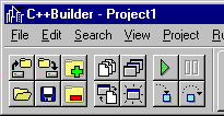
The most common use for SpeedButton components configured this way is to place them on a toolbar on which each button executes a command. C++Builder uses SpeedButton components on the left side of the toolbar (the file, view, and debugging commands), as shown in Figure A.
Figure A: C++Builder uses SpeedButton components to implement the command buttons on the toolbar.
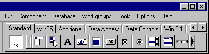
Figure B: The right side of the toolbar displays the Component Palette, which consists of several radio speedbuttons.
In effect, these buttons, which we'll call radio speedbuttons, act in the same way as a set of radio buttons: One button must be down initially, but you can't choose more than one at a time. To implement radio speedbuttons with SpeedButton components, place several of them on a form, then change each one's GroupIndex property to the same value.
Unlike standard radio buttons, you can create more than one set of radio speedbuttons within a given form without having them interact. To do so, use a different GroupIndex value for each set of radio speedbuttons.
For example, how would you design a dialog box that asks users which of a set of optional, supplementary dictionaries to use? In other words, you want them to specify one of the supplementary dictionaries to use, but only one--or, if they prefer, no dictionary at all.
Using a set of SpeedButton components, you can define this type of button set, which we'll call exclusive option buttons. To do so, first set the AllowAllUp property to True for each button, then specify the same GroupIndex property for the set.
To create a state button, first set its AllowAllUp property to True, then set its GroupIndex property to a unique value. As you create additional state buttons, you'll need to use a new value for the GroupIndex property each time to keep them from becoming exclusive option buttons.