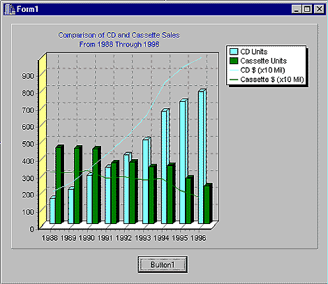
The C++ Builder 3.0 professional and Client/Server edition ships with a VCL component called TChart. It's a powerful tool for creating charts and graphs, but the TChart printed documentation and online Help were (unfortunately) created for Delphi--leaving the C++ programmer with a bit of guesswork. Our goal in this article is to introduce you to TChart by showing you how to integrate some very basic charts into your C++Builder applications. The finished product that will be created can be seen in Figure A.
Figure A: The final graph incorporates all our desired features.
Table A: Programming language usage
| Language | % |
| C++ | 22 |
| C | 29 |
| COBOL | 35 |
| Smalltalk | 10 |
| Ada | 4 |
Figure B: The TChart sample application looks like this at design time.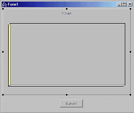
Next, add the following code to Button1's OnClick event handler (double-click Button1 to open the OnClick event handler method in the code window):
TPieSeries *langs = new TPieSeries(this);
langs->ParentChart = Chart1;
langs->Add(22.0, "C++", clRed);
langs->Add(29.0, "C", clBlue);
langs->Add(35.0, "COBOL", clGreen);
langs->Add(10.0, "FORTRAN", clYellow);
langs->Add(4.0, "Ada", clBlack);
Run the program and click Button1 to see the pie chart. That was simple enough! You may find it peculiar that we never told Chart1, via its properties, that it was going to be a pie chart. That's taken care of by attaching a series to the TChart. A series is nothing more than a data set that contains a list of values along with their labels and colors. The type of series defines the way its data values will be plotted; we created an instance of TPieSeries to get a pie chart, for example. We then attached the series to the chart by setting langs' ParentChart property to Chart1.
Finally, the Add method creates each slice of the pie. The Add method accepts three arguments: the value to plot, a label, and the color that should be used to represent this value on the chart. Here's a look at Add's prototype:
int __fastcall Add(const double AValue,
    const System::AnsiString ALabel,
    Graphics::TColor AColor);
Now, let's try our hand at a bar chart. Table B shows the number of CDs and cassettes sold between 1988 and 1996, along with their net dollar value (all figures are in millions).
Table B: CD and cassette sales in millions of units and dollars from 1988 to 1996
| Year | CD units | CD value | CAS units | CAS value |
| 1988 | 149.9 | 2089.9 | 450.1 | 3385.1 |
| 1989 | 207.5 | 2587.5 | 446.2 | 3345.8 |
| 1990 | 286.5 | 3451.6 | 442.2 | 3472.4 |
| 1991 | 333.3 | 4337.7 | 360.1 | 3019.6 |
| 1992 | 407.5 | 5326.5 | 336.4 | 3116.3 |
| 1993 | 495.4 | 6511.4 | 339.5 | 2915.8 |
| 1994 | 662.1 | 8464.5 | 345.4 | 2976.4 |
| 1995 | 722.9 | 9377.4 | 272.6 | 2303.6 |
| 1996 | 778.9 | 9934.7 | 225.3 | 1905.3 |
Replace the pie chart code in Button1's OnClick event handler with the following (be sure you delete all of the old code):
TBarSeries* cdSeries =
    new TBarSeries(this);
cdSeries->ParentChart = Chart1;
cdSeries->Add(149.7, "", clRed);
cdSeries->Add(207.2, "", clRed);
cdSeries->Add(286.5, "", clRed);
cdSeries->Add(333.3, "", clRed);
cdSeries->Add(407.5, "", clRed);
cdSeries->Add(495.4, "", clRed);
cdSeries->Add(662.1, "", clRed);
cdSeries->Add(722.9, "", clRed);
cdSeries->Add(778.2, "", clRed);
Now, when you run the program, you've got a bar chart representing CD units
shipped. You simply associated an instance of TBarSeries with Chart1 and added
individual bars for each year.
Notice that you can elect not to specify a label for each value by supplying
empty quotes ("") as the label argument. If you don't specify a label, the
value (first argument) will appear on the chart as the label. One look at the
list of Add methods in our event handler would leave even the fastest typist
searching for an easier way to specify a large number of values--and you're in
luck. You can add the values to the cdSeries using the AddArray method. To do
so, replace the OnClick event code in Button1 with the following:double cdUnits[] = {149.7,207.2,286.5,
333.3,407.5,495.4,662.1,722.9,778.9};
TBarSeries* cdSeries =
new TBarSeries(this);
cdSeries->ParentChart = Chart1;
cdSeries->
AddArray(cdVals,
sizeof(cdUnits)/sizeof(cdUnits[0]))-1);
The call to AddArray replaces the list of Add calls you had to type earlier. Keep in mind that if you use AddArray, labels will default to the value of each series element, and TChart will automatically select a color for you. You can also control the color of an entire series by setting the SeriesColor property, like this:
cdSeries->SeriesColor = clBlue;
Chart1->Title->Text->Clear();
Chart1->Title->Text->
Add("Comparison of CD and Cassette Sales");
Chart1->Title->Text->
Add("From 1988 Through 1996");
Next, you add the units sold figures for cassettes (in millions). Here's what Button1's OnClick event handler should look like with the cassette data added:
double cdUnits[] = {149.7,207.2,286.5,
  333.3,407.5,495.4,662.1,722.9,778.9};
double caUnits[] = {450.1,446.2,442.2,
  360.1,366.4,339.5,345.4,272.6,225.3};

TBarSeries* cdSeries = new TBarSeries(this);
TBarSeries* caSeries = new TBarSeries(this);
cdSeries->Title = "CD Units";
caSeries->Title = "Cassette Units";
cdSeries->ParentChart = Chart1;
caSeries->ParentChart = Chart1;
cdSeries->AddArray(cdUnits,
  (sizeof(cdUnits)/sizeof(cdUnits[0]))-1);
caSeries->AddArray(caUnits,
  (sizeof(caUnits)/sizeof(caUnits[0]))-1);
Chart1->Title->Text->Clear();
Chart1->Title->Text->
  Add("Comparison of CD and Cassette Sales");
Chart1->Title->Text->
  Add("From 1988 Through 1996");
When you run the program, you'll notice that TChart has automatically assigned a unique color to each series (remember, you can control the color for an entire series with the SeriesColor property). The only problem is those little labels above each column--they make it difficult to see all of the bars. You can remove them by setting the Marks->Visible property to false for each series. Try adding these two lines just before setting cdSeries->ParentChart to Chart1:
cdSeries->Marks->Visible = false;
caSeries->Marks->Visible = false;
Not bad so far, but the chart is still missing the dollar value figures. Since adding another set of bars for the dollar values will really muddy up the chart, let's add the dollar figures using another type of series called TFastLine (you can check the online Help for a complete list of series types and their properties). In addition to allowing you to associate multiple series with a single chart, TChart lets you combine different types of series, as well. Because the dollar figures are considerably larger than the units sold figures, you'll move the decimal point one space to the left (stating the figures in tens of millions). The new Button1 OnClick event handler appears in Listing A.
Listing A: Button1 OnClick event handler
double cdUnits[] = {149.7,207.2,286.5,
  333.3,407.5,495.4,662.1,722.9,778.9};
double cdValue[] = {208.99,258.75,345.16,
  433.77,532.65,651.14,846.45,937.74,993.47};
double caUnits[] = {450.1,446.2,442.2,
  360.1,366.4,339.5,345.4,272.6,225.3};
double caValue[] = {338.51,334.58,347.24,
  301.96,311.63,291.58,297.64,230.36,190.53};

TBarSeries* cdSeries = new TBarSeries(this);
TBarSeries* caSeries = new TBarSeries(this);
TFastLineSeries *cdDollars = new
    TFastLineSeries(this);
TFastLineSeries *caDollars = new
    TFastLineSeries(this);
cdSeries->Title = "CD Units";
caSeries->Title = "Cassette Units";
cdDollars->Title = "CD $ (x10 Mil)";
caDollars->Title = "Cassette $ (x10 Mil)";
cdSeries->Marks->Visible = false;
caSeries->Marks->Visible = false;
cdSeries->ParentChart = Chart1;
caSeries->ParentChart = Chart1;
cdDollars->ParentChart = Chart1;
caDollars->ParentChart = Chart1;
cdDollars->SeriesColor =
    cdSeries->SeriesColor;
caDollars->SeriesColor =
    caSeries->SeriesColor;
cdSeries->AddArray(cdUnits,
  (sizeof(cdUnits)/sizeof(cdUnits[0]))-1);
caSeries->AddArray(caUnits,
  (sizeof(caUnits)/sizeof(caUnits[0]))-1);
cdDollars->AddArray(cdValue,
  (sizeof(cdValue)/sizeof(cdValue[0]))-1);
caDollars->AddArray(caValue,
  (sizeof(caValue)/sizeof(caValue[0]))-1);
Chart1->Title->Text->Clear();
Chart1->Title->Text->
  Add("Comparison of CD and Cassette Sales");
Chart1->Title->Text->
  Add("From 1988 Through 1996");
Notice how the code uses the SeriesColor property to set cdDollars and caDollars so that they matched their counterparts (cdSeries and caSeries). It wasn't necessary to set the Marks->Visible property to false for the TFastLine series, because it doesn't support Marks (you'd need to use TLineSeries to get them--TFastLine's interface isn't as robust, as it was meant for operations where speed counts).
When you run the program now, you'll notice that you still need to do something with the X-axis labels. They're supposed to relay the year to which the sales figures apply, but default to the values 0 to 8 instead (the offsets of the series values in the array). Let's change that now by placing the following for loop after the AddArray statements:
for ( int i = 1988; i < 1997; i++ )
   cdSeries->XLabel[i - 1988] = i;
Each series element has an associated label stored in the XLabel array. You can change any value's label by changing elements in this array. Figure A, on the cover, shows the final product.
long x = caDollars->Count();Removing a series from a chart is no big deal--simply deactivate it, disassociate it from the parent TChart, and then delete it, as follows:
caSeries->Active= false;
caSeries->ParentChart = NULL;
delete caSeries;
You can prevent a series from appearing in your chart's legend by setting its ShowInLegend property to false:
cdSeries->ShowInLegend = false;
If you look at the online Help and Object Inspector for TChart, you'll see that many methods and properties are available. Your charts can even respond to events (such as drag and drop).