In this series of articles, Iĺll show you how to create a TButton-descendant component that will handle all of your button needs. In this first installment, Iĺll discuss how to create a generic owner-drawn button and how to use this technique to extend the TButton class to accept a color specification.
Like many standard control classes, the Windows BUTTON control provides a so-called "owner-drawn" style, which allows you to customize the appearance of a button. This style is specified by adding BS_OWNERDRAW to the other styles that youĺd normally pass as the dwStyle parameter to the CreateWindowEx() API function. Letĺs see how this is done by working through an example.
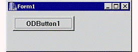
Figure A
A form that contains an owner-drawn button.
Figure A depicts a form that contains one child control: an owner-drawn button thatĺs created directly via the CreateWindowEx() API function:
// in Form1ĺs header...
private:
HWND hODButton_;
// in Form1ĺs source...
__fastcall TForm1::TForm1(
TComponent* Owner) : TForm(Owner)
{
hODButton_ = CreateWindowEx(
0, "BUTTON", "ODButton1",
WS_CHILD | WS_VISIBLE | BS_OWNERDRAW,
10, 10, 75, 25,
Handle, NULL, HInstance, NULL
);
}By specifying the BS_OWNERDRAW style, youĺre effectively telling the button that you want to take over its rendering process. This is doneŚas it is with other owner-drawn controlsŚby handling the WM_DRAWITEM message thatĺs sent by the button to its parent window whenever the button needs to be drawn. For our example, because Form1 is the parent of the button, we need to handle the WM_DRAWITEM thatĺs sent to Form1. We can do this by augmenting the TForm::Dispatch() method (via the message-mapping macros), like so:
// in Form1ĺs header...
private:
MESSAGE void __fastcall WMDrawItem(
TMessage& Msg);
public:
BEGIN_MESSAGE_MAP
MESSAGE_HANDLER(
WM_DRAWITEM, TMessage, WMDrawItem)
END_MESSAGE_MAP(TForm)
// in Form1ĺs source...
void __fastcall TForm1::
WMDrawItem(TMessage& Msg)
{
// grab a pointer to the DRAWITEMSTRUCT
const DRAWITEMSTRUCT* pDrawItem =
reinterpret_cast<DRAWITEMSTRUCT*>
(Msg.LParam);
// if the message is from our button...
if (pDrawItem->hwndItem == hODButton_)
{
// grab a handle to the target DC
const HDC hButtonDC = pDrawItem->hDC;
// extract the target rectangle
RECT RButton = pDrawItem->rcItem;
// is the button pushed?
const bool is_pushed =
pDrawItem->itemState & ODS_SELECTED;
// does the button have focus?
const bool is_focused =
pDrawItem->itemState & ODS_FOCUS;
// set the rendering flags to draw
// a regular push button, and adjust
// the rendering flags according to
// the button's current state
unsigned int flags = DFCS_BUTTONPUSH;
if (is_pushed) flags |= DFCS_PUSHED;
// render the push button by using
// the DrawFrameControl() function
DrawFrameControl(
hButtonDC, &RButton,
DFC_BUTTON, flags
);
// render the button's text...
RECT RButtonText = RButton;
if (is_pushed)
{
OffsetRect(&RButtonText, 1, 1);
}
DrawText(
hButtonDC, "ODButton1\0", -1,
&RButtonText, DT_CENTER |
DT_VCENTER | DT_SINGLELINE
);
// indicate keyboard focus (here via
// an etched edge rather than the
// traditional focus rectangle)...
if (is_focused)
{
InflateRect(&RButton, -4, -4);
DrawEdge(
hButtonDC, &RButton,
EDGE_ETCHED, BF_RECT
);
}
// return TRUE for this message
Msg.Result = TRUE;
}
// otherwise, pass the message along
else TForm::Dispatch(&Msg);
}You can see from this code that the first step is to grab a pointer to a DRAWITEMSTRUCT structure, which is sent with the WM_DRAWITEM message via the LParam data member. This structure holds all of the crucial drawing-related information such as the target device context (in the hDC data member), the target rectangle (in the rcItem data member), and the current state of the button (in the itemState data member). With this information, youĺll know where to draw (hDC), what area to draw (rcItem), and in what state (itemState) you should draw the button. In fact, how you draw the button is up to you. As depicted in Figure A, this code will render a standard push-button with an etched selection rectangle. Note that when the button is pushed, the itemState data member will contain the ODS_SELECTED bit. Likewise, when the button has keyboard focus, itemState will contain the ODS_FOCUS bit. And, when the button is disabled, itemState will contain the ODS_DISABLED bit.
Unfortunately, this example isnĺt too useful because most of us never call the CreateWindowEx() function directly. We could create a TWinControl descendant class to handle this work, but because the TButton class is designed specifically for buttons, letĺs start there. Weĺll still need to specify the BS_OWNERDRAW style to create an owner-draw button, but we can do this from within the CreateParams() method of our TButton descendant class.
Iĺve just shown you how to create a simple owner-drawn button. Letĺs now work on wrapping this functionality into a reusable VCL component, which Iĺll call TColorButton. The declaration of this class is provided in Listing A.
Notice that the TColorButton class introduces three published properties: Color, ColorLo, and ColorHi. As you can guess, the Color property will be used to specify the color of the buttonĺs face. This property is maintained by using the Color property of the buttonĺs Brush. The ColorLo and ColorHi properties will be used to specify the colors of the buttonĺs shadow and highlight, respectively. These latter two properties are maintained via the private ColorLo_ and ColorHi_ members, which we can initialize in the class constructor, like so:
__fastcall TColorButton::
  TColorButton(TComponent* Owner)
    : TButton(Owner),
    ColorLo_(clBtnShadow),
    ColorHi_(clBtnHighlight),
    Canvas_(new TCanvas(),
    draw_as_default_(false)
{
}
Note that the private Canvas_ member is also initialized in the constructor. Later, Iĺll show you how to use this TCanvas object to ease the drawing process. The constructor is also used to initialize the draw_as_default_ member, whose role Iĺll discuss shortly.
As I mentioned earlier, weĺll use the CreateParams() method to specify the BS_OWNERDRAW style. Hereĺs the code for that method:
void __fastcall TColorButton::
  CreateParams(TCreateParams& Params)
{
  TButton::CreateParams(Params);
  Params.Style |= BS_OWNERDRAW;
}
By adding BS_OWNERDRAW to the TCreateParams::Style data member, this code effectively instructs the TButton class (and thus the TWinControl class) to pass BS_OWNERDRAW to the CreateWindowEx() function, which is later called from within the TWinControl::CreateWnd() method. Notice, though (from Listing A), that the TColorButton class also overrides the TButton::SetButtonStyle() method. This step is needed because the TButton class uses SetButtonStyle() to change the buttonĺs style to BS_PUSHBUTTON or BS_DEFPUSHBUTTON depending on the value of the ADefault parameter. In our case, we want to preserve the BS_OWNERDRAW specification, so we need to override the SetButtonStyle() method:
void __fastcall TColorButton::
  SetButtonStyle(bool ADefault)
{
  if (draw_as_default_ != ADefault)
  {
    draw_as_default_ = ADefault;
    InvalidateRect(Handle, NULL, FALSE);
  }
}
This code updates the value of the private draw_as_default_ member according to the ADefault parameter. Weĺll later use this member to determine if the button should be drawn as the default button (i.e., with a thick black border).
That takes care of creating an owner-drawn button, but whereĺs the actual drawing code? Well, this is where the TColorButton::CNDrawItem() method comes into play.
Recall that a normal owner-drawn button sends its parent window the WM_DRAWITEM message, which simply instructs the parent window that the button needs to be drawn or redrawn. This means that if you place a TColorButton object directly on a form, you can handle the WM_DRAWITEM message by tapping into the formĺs window procedure (just as we did before). This isnĺt too hard for a formŚyou simply augment the TForm::Dispatch() member function (by using the message-mapping macros). What do you do, though, if you want to place your TColorButton object on, say, a panel? Do you subclass the panel? Or, do you create a new TPanel descendant class and augmentĺs its Dispatch() member function? Either of these options results in too much work.
Fortunately, when any TWinControl descendant receives the WM_DRAWITEM message, it will forward a copy of the messageŚcalled CN_DRAWITEMŚback to the button itself. This way, you can handle the CN_DRAWITEM message from within the buttonĺs window procedure without worrying about which control the button is placed on. From the declaration of the TColorButton class, you can see that this message is mapped to the CNDrawItem() method. Itĺs from within this method that you can draw the button in a new, customized fashion. Here, weĺll use the Color, ColorLo, and ColorHi specificationsŚalong with our TCanvas objectŚto render a colored button:
void __fastcall TColorButton::
  CNDrawItem(TMessage& Msg)
{
  // grab pointer to the DRAWITEMSTRUCT
  const DRAWITEMSTRUCT* pDrawItem =
    reinterpret_cast<DRAWITEMSTRUCT*>
      (Msg.LParam);

  // store the current state of
  // the target DC
  SaveDC(pDrawItem->hDC);
  // bind Canvas_ to the target DC
  Canvas_->Handle = pDrawItem->hDC;
  try
  {
    // extract the state flags...
    TOwnerDrawState state;
    // if the button has keyboard focus
    if (pDrawItem->itemState & ODS_FOCUS)
    {
      state = state << odFocused;
    }
    // if the button is pushed
    if (pDrawItem->itemState &
        ODS_SELECTED)
    {
      state = state << odSelected;
    }
    // if the button is disabled
    if (pDrawItem->itemState &
        ODS_DISABLED)
    {
      state = state << odDisabled;
    }

    // draw the button's face
    DoDrawButtonFace(state);

    // draw the button's text
    DoDrawButtonText(state);
  }
  catch (...)
  {
    // clean up
    Canvas_->Handle = NULL;
    RestoreDC(pDrawItem->hDC, -1);
  }
  // clean up
  Canvas_->Handle = NULL;
  RestoreDC(pDrawItem->hDC, -1);

  // reply TRUE
  Msg.Result = TRUE;
}Youĺll notice that this definition of the TColorButton::CNDrawItem() method is somewhat similar to the previous definition of the TForm1::WMDrawItem() method. Here, instead of actually drawing the button from within the CNDrawItem() method, the TColorButton class fills a TOwnerDrawState-type variable, and then punts the work to its DoDrawButtonFace() and DoDrawButtonText() methods.
Weĺll render the buttonĺs face from within the TColorButton::DoDrawButtonFace() method. Hereĺs the code for that method:
void __fastcall TColorButton::
  DoDrawButtonFace(
    const TOwnerDrawState& state
    )
{
  // draw a colored button...
  Canvas_->Brush = Brush;
  TRect RClient = ClientRect;

  // if the button is the default button
  // or has keyboard focus...
  if (draw_as_default_ ||
      state.Contains(odFocused))
  {
    Canvas_->Pen->Color = clWindowFrame;
    Canvas_->Rectangle(
       RClient.Left, RClient.Top,
       RClient.Right, RClient.Bottom
       );
    InflateRect(
       reinterpret_cast<PRECT>(&RClient),
       -1, -1
       );
  }

  // if the button is pushed...
  if (state.Contains(odSelected))
  {
    Canvas_->Pen->Color = ColorLo_;
    Canvas_->Rectangle(
       RClient.Left, RClient.Top,
       RClient.Right, RClient.Bottom
       );
  }

  // if the button isn't pushed...
  else
  {
    Canvas_->FillRect(RClient);
    Frame3D(
      Canvas_.get(), RClient,
      ColorHi_, clWindowFrame, 1
      );

    POINT P[] = {
      {1, RClient.Bottom - 1},
      {RClient.Right - 1,
       RClient.Bottom - 1},
      {RClient.Right - 1,
       RClient.Top - 1}
      };
    Canvas_->Pen->Color = ColorLo_;
    Canvas_->Polyline(
       reinterpret_cast<TPoint*>(P), 2
       );
  }
}Thereĺs nothing special about this codeŚI simply took some screenshots of a button in its various states, examined its appearance, and then worked through the necessary TCanvas methods. You might be wondering why I didnĺt use the DrawFrameControl() API function. Unfortunately, that function will always render a button in its default color (clBtnFace).
The next task is to render the buttonĺs caption. Weĺll do this from within the TColorButton::DoDrawButtonText() member function, like so:
void __fastcall TColorButton::
  DoDrawButtonText(
    const TOwnerDrawState& state)
{
  if (Caption.Length() == 0) return;

  RECT RText = {0, 0, Width, Height};
  Canvas_->Font = Font;
  Canvas_->Brush = Brush;
  SetBkMode(
    Canvas_->Handle, TRANSPARENT
    );

  // if the button is pushed...
  if (state.Contains(odSelected))
  {
     // offset the caption
     OffsetRect(&RText, 1, 1);
  }
  // if the button is disabled...
  if (!Enabled ||
      state.Contains(odDisabled))
  {

    // render the caption
    // in a disabled fashion
    OffsetRect(&RText, 1, 1);
    Canvas_->Font->Color = ColorHi_;
    DrawText(
      Canvas_->Handle, Caption.c_str(),
      -1, &RText, DT_CENTER |
      DT_VCENTER | DT_SINGLELINE
      );
    OffsetRect(&RText, -1, -1);
    Canvas_->Font->Color = ColorLo_;
  }

  // render the caption
  DrawText(
    Canvas_->Handle, Caption.c_str(), -1,
    &RText, DT_CENTER | DT_VCENTER |
    DT_SINGLELINE
    );

  // if the button has keyboard focus...
  if (state.Contains(odFocused))
  {
    // render the selection rectangle
    TRect RFocus = ClientRect;
    InflateRect(
      reinterpret_cast<PRECT>(&RFocus),
      -4, -4
      );
    Canvas_->DrawFocusRect(RFocus);
  }
}
The bulk of the work of drawing the buttonĺs caption is handled by the DrawText() API function. This function is particularly handy because it will center the textŚboth vertically and horizontallyŚwithin the rectangle that you specify via the fourth (lpRect) parameter. Notice that when the button is disabled, the DrawText() function is called twice to achieve the chiseled effect. Also, when the button has keyboard focus, we use the TCanvas::DrawFocusRect() method to render the selected rectangle.
That takes care of drawing the buttonĺs face, text, and selection rectangle. Letĺs now focus on the rest of TColorButtonĹs methods
As you might have guessed, the GetColor(), SetColor(), SetColorLo(), and SetColorHi() methods provide access to the Color, ColorLo, and ColorHi properties. Hereĺs how these methods are defined:
TColor __fastcall TColorButton::
  GetColor()
{
  return Brush->Color;
}

void __fastcall TColorButton::
  SetColor(TColor Value)
{
  if (Brush->Color != Value)
  {
    Brush->Color = Value;
    InvalidateRect(Handle, NULL, TRUE);
  }
}

void __fastcall TColorButton::
  SetColorLo(TColor Value)
{
  if (ColorLo_ != Value)
  {
    ColorLo_ = Value;
    InvalidateRect(Handle, NULL, TRUE);
  }
}

void __fastcall TColorButton::
  SetColorHi(TColor Value)
{
  if (ColorHi_ != Value)
  {
    ColorHi_ = Value;
    InvalidateRect(Handle, NULL, TRUE);
  }
}
The CMFontChanged() and CMEnabledChanged() methods are called when the button receives the CM_FONTCHANGED and CM_ENABLEDCHANDED messages, respectively. These are VCL-specific messages that are sent to the button when its Font or Enabled properties have changed (either at design time or at run time). When this happens, we need to instruct the button to repaint itself:
void __fastcall TColorButton::
  CMFontChanged(TMessage& Msg)
{
  TButton::Dispatch(&Msg);
  InvalidateRect(Handle, NULL, TRUE);
}

void __fastcall TColorButton::
  CMEnabledChanged(TMessage& Msg)
{
  TButton::Dispatch(&Msg);
  InvalidateRect(Handle, NULL, TRUE);
}Thereĺs one last method: WMLButtonDblClk(). You can see from Listing A that this method is called whenever the button receives the WM_LBUTTONDBLCLK message; this message is sent whenever the button is double-clicked. Because a normal button (i.e., a non-owner-drawn push-button) processes this message as if it were a WM_LBUTTONDOWN message, weĺll need to do the same (otherwise, the button will react very slowly when itĺs clicked rapidly). Hereĺs the definition of the WMLButtonDblClk() method:
void __fastcall TColorButton::
  WMLButtonDblClk(TMessage& Msg)
{
  SNDMSG(
    Handle, WM_LBUTTONDOWN,
    Msg.WParam, Msg.LParam
    );
}
Figure B shows a form containing several TColorButtons.
Figure B
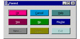
Some TColorButton objects.
Iĺve shown you how to create an owner-drawn button and how to use this style to create a colored-button component. Next month, Iĺll show you how to extend this technique even further. Iĺll discuss how to add a glyph to the button, and how to define the buttonĺs face by using a custom bitmap (which is the first step toward creating an application that supports skins). For now, experiment with the code for the TColorButton component; itĺs available for download from www.residorph.com.
Listing A: Declaration of the TColorButton class
#include <memory>
class TColorButton : public TButton
{
public:
  __fastcall TColorButton(TComponent* Owner);

__published:
  __property TColor Color =
    {read = GetColor, write = SetColor};
  __property TColor ColorLo =
    {read = ColorLo_, write = SetColorLo,
     default = clBtnShadow};
  __property TColor ColorHi =
    {read = ColorHi_, write = SetColorHi,
     default = clBtnHighlight};

protected:
  // inherited member functions
  virtual void __fastcall CreateParams(
    TCreateParams& Params);
  virtual void __fastcall SetButtonStyle(
    bool ADefault);

  // introduced member functions
  virtual void __fastcall DoDrawButtonFace(
    const TOwnerDrawState& state);
  virtual void __fastcall DoDrawButtonText(
    const TOwnerDrawState& state);

private:
  TColor ColorLo_;
  TColor ColorHi_;
  std::auto_ptr<TCanvas> Canvas_;
  bool draw_as_default_;

  TColor __fastcall GetColor();
  void __fastcall SetColor(TColor Value);
  void __fastcall SetColorLo(TColor Value);
  void __fastcall SetColorHi(TColor Value);

  MESSAGE void __fastcall CNDrawItem(
    TMessage& Msg);
  MESSAGE void __fastcall WMLButtonDblClk(
    TMessage& Msg);
  MESSAGE void __fastcall CMFontChanged(
    TMessage& Msg);
  MESSAGE void __fastcall CMEnabledChanged(
    TMessage& Msg);

public:
BEGIN_MESSAGE_MAP
  MESSAGE_HANDLER(
    CN_DRAWITEM, TMessage, CNDrawItem)
  MESSAGE_HANDLER(
    WM_LBUTTONDBLCLK, TMessage, WMLButtonDblClk)
  MESSAGE_HANDLER(
    CM_FONTCHANGED, TMessage, CMFontChanged)
  MESSAGE_HANDLER(
    CM_ENABLEDCHANGED, TMessage, CMEnabledChanged)
END_MESSAGE_MAP(TButton)
};