by Kent Reisdorph
I frequently see users of the Borland newsgroups asking, "How do I show certain items in a list box as disabled?" Or, "How do I make items in my list box different colors?" The answer to both of these questions is the same: Use an owner-drawn list box.
Fortunately the VCL makes it relatively easy to create owner-drawn list boxes and combo boxes. You need to understand the basics of how owner-drawn controls work, but once you do, the rest is easy. By owner-drawing list boxes and combo boxes you can display items in different colors, display bitmaps in the control, or even create highly customized list boxes for specialty applications such as games.
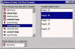
This article will explain how to create owner-drawn list boxes and combo boxes. I will focus on list boxes, but everything you read will apply to combo boxes as well. The example program for this article displays two owner-draw list boxes, and one owner-drawn combo box as shown in Figure A.
Figure A
The example program shows how to create owner-drawn list boxes and combo boxes.
As I have said, the VCL makes it easy to owner-draw list boxes and combo boxes. It is not necessary for you to write specialized components in order to have owner-drawn list boxes. You only need to set a property or two and respond a couple of VCL events. Creating an owner-drawn list box requires these steps:
I.Set the Style property to either lbOwnerDrawFixed or lbOwnerDrawVariable.
II.Create an event handler for the OnDrawItem event and write the drawing code in that event handler.
III.Optionally, create an event handler for the OnMeasureItem event.
The steps themselves are easy, but writing the code that draws the list box items can be a bit challenging at first. I will explain what is required for each of these steps in the following sections.
The items in a list box or combo box can all be the same height (owner-draw fixed) or each item can have a different height (owner-draw variable). The type of the list box is controlled through the Style property. For a fixed-height list box, set the Style property to lbOwnerDrawFixed. For a variable-height list box, set the Style to lbOwnerDrawVariable.
Fixed-height list boxes are much more common than variable-height list boxes. After you set the Style property to lbOwnerDrawFixed, you must provide an event handler for the OnDrawItem event. OnDrawItem will be fired for every item in the list box that requires painting. I’ll discuss the OnDrawItem event in the next section. For fixed-height list boxes you must set the ItemHeight property to the desired height of the list box items. The OnMeasureItem event is not used for fixed-height list boxes and, in fact, is never generated for fixed-height list boxes.
Variable-height list boxes require only slightly more work than fixed-height list boxes. The additional work comes in the form of telling Windows the exact height of each list box item. This is done through the OnMeasureItem event. There are a number of ways in which you might determine the item height. That process is implementation-specific so I won’t go into the possibilities here. Instead, I will show you an example of setting the item height by brute force using a switch statement. The OnMeasureItem event handler looks like this:
void __fastcall
TMainForm::ListBox2MeasureItem(
  TWinControl *Control,
  int Index, int &Height)
{
  switch (Index) {
    case 0 : Height = 20; break;
    case 1 : Height = 40; break;
    case 2 : Height = 15; break;
    case 3 : Height = 30; break;
    case 4 : Height = 25; break;
  }
}
The Index parameter tells you the item for which Windows is requesting the height. The Height parameter is used to pass the height of the item back to the VCL (which, in turn, passes the information on to Windows). The example program for this article contains a variable-height owner-drawn list box (refer back to Figure A). You can download and examine the code to see how to implement a variable-height list box.
The challenging part of owner-drawn list boxes is in writing the code that draws each item. You are responsible for drawing each list box item in its entirety (the VCL handles drawing of the focus rectangle for selected items but you must do the rest of the drawing yourself). There are several aspects to consider when drawing the items. For example, the item needs to be drawn one way when the item is not selected, and drawn another way when the item is selected. First, take a look at an empty OnDrawItem event handler and then I’ll explain further:
void __fastcall
TMainForm::ListBox1DrawItem(
  TWinControl *Control, int Index,
  TRect &Rect, TOwnerDrawState State)
{
}
The Control parameter is a pointer to the control that generated the event. You can use the Control parameter if you want to use the same OnDrawItem event handler for multiple controls (list boxes or combo boxes). The Index parameter is the index number of the item that needs to be drawn. The Rect parameter is the clipping rectangle for the item. Any drawing you do must be within this rectangle. The State parameter tells you whether the item is selected or not selected, among other things. The State parameter is important in that it tells you whether you need to draw the item as selected or not selected.
Drawing the items is itself a multi-step process. I’ll break down those steps into sections to make it easier to digest.
One of the first things you’ll need to do is determine the colors needed to draw the background and the text of the item. This is essentially a two-step process. The first step is to determine if the item is to be drawn selected or normal. The second step is to ask Windows for the colors you’ll need to drawn the items. Here’s the code:
TColor backColor;
TColor textColor;
if (State.Contains(odSelected)) {
  backColor = (TColor)
    GetSysColor(COLOR_HIGHLIGHT);
  textColor = (TColor)
    GetSysColor(COLOR_HIGHLIGHTTEXT);
}
else {
  backColor = (TColor)
    GetSysColor(COLOR_WINDOW);
  textColor = (TColor)
    GetSysColor(COLOR_WINDOWTEXT);
}
This code first determines if the odSelected value is in the State parameter (the State parameter is a set). If so, the background color is set to Windows’ COLOR_HIGHLIGHT value, and the text color is set to Windows’ COLOR_HIGHLIGHTTEXT value. If odSelected is not in the State parameter then the Windows colors for the window background and window text are used.
It is important to get the color values from Windows. It is important because you want to be sure that you draw the list box according to the user’s color preferences. If you simply hard code colors into your drawing routine, your application will look odd on systems where the user has changed the default color settings.
Drawing the background is trivial, but still important. You must "erase" the background of the item prior to drawing any text or graphics you want displayed for the item. Erasing the background is really a matter of filling the item’s drawing rectangle with the background color (as determined by the previous step). Here is the code:
ListBox1->Canvas->Brush->Color =
  backColor;
ListBox1->Canvas->FillRect(Rect);
Remember, the Rect parameter of the OnDrawItem event handler is the rectangle within which you can draw. This code simply sets the list box’s brush color to the background color and draws a rectangle with that color.
Almost every list box contains text. Naturally, you will have to draw the text for each list box item. The first step is to determine what text you want displayed. Depending on how you have stored the item information, you may display all of the text in the item, part of the text, or get the text from an external source. This is one of the advantages to owner-drawn list boxes. The data stored in each item may or may not be textual. For example, you may choose to store a class instance in the Object property of the list box items and obtain the display text from that class. Let me take a moment to explain.
Let’s say that you were creating a list box that displayed bitmaps along with a description of the bitmap. You might create a class that handles the bitmap, contains the display text, and manages other details of the list box item. When you fill the list box, you would add pointers to each object to the Objects property of the list box items. You could then extract the description string from the object before drawing the list box item. There are a multitude of methods you could use to obtain the display text and this is just one example. The point is that with owner-drawn list boxes you are in control of what the display text is and where it comes from.
After you have determined the text you will draw, the actual drawing of the text can be accomplished in several ways. One way is to use TCanvas’s TextOut() or TextRect() methods. Another, more flexible, way is to use the Windows API function DrawText(). I recommend DrawText() because it gives you full control over how the text is drawn within the clipping rectangle. The text can be centered horizontally or vertically, can be aligned left or right, can be single line or multi-line, and can even be displayed with an ending ellipsis if the text is too wide for the list box. See the DrawText() item in the Win32 API help for a complete listing of the drawing options available. Listing A shows the OnDrawItem event handler for the example program’s main list box. Examine the code to see how the item text is drawn.
Essentially, you can draw anything you want in your owner-drawn list boxes. You can use the list box’s Canvas to do your drawing, use the Windows API, or any combination of the two. The example program for this article contains both a list box and a combo box that show all of the button bitmaps that ship with C++Builder and the file name of each bitmap (assuming you installed the bitmaps when you installed C++Builder). Refer to Listing A for the code that draws the bitmaps and the item text. Note that the text is displayed to the right of the bitmap, and centered within the list box item.
It is probably not clear from the code how I obtain the display text and the bitmap’s filename. When I fill the list box I create item text that is structured like this:
abort.bmp=c:\images\buttons\abort.bmpThis format follows the TStringList class’s Name=Value mechanism. The first part of the string (the Name) is the display text for the list box item. The second part of the string (the Value) is the actual path and filename of the bitmap file. I extract these two portions of the string and store them in local variables for user later in the function. Once again, I refer you to Listing A to see how the item’s display text is extracted from the item text stored in the list box.
Creating owner-drawn list boxes and combo boxes is not difficult once you understand the principles. The full source for this article’s example program can be downloaded from our Web site at www.bridgespublishing.com. The example shows how to both draw fixed and variable-height list boxes. As an added bonus, it also shows how to enumerate all the files in a directory using the Windows API functions FindFirstFile() and FindNextFile(). Owner-drawn list boxes can be used to convey application-specific information to the user in one neat package.
Listing A: The Example Program’s OnDrawItem Event Handler
void __fastcall
TMainForm::ListBox1DrawItem(TWinControl *Control,
  int Index, TRect &Rect, TOwnerDrawState State)
{
  // Get the name of the file.
  // This will be used in the list box display.
  String name = ListBox1->Items->Names[Index];

  // Get the actual filename from the Values
  // property. We'll use this filename to load
  // the bitmap for display.
  String filename = ListBox1->Items->Values[name];

  TColor backColor;
  TColor textColor;

  // Set up the colors used to draw the background
  // and the text.If the item is selected then use
  // the Windows selection colors.
  if (State.Contains(odSelected)) {
    backColor =
      (TColor)GetSysColor(COLOR_HIGHLIGHT);
    textColor =
      (TColor)GetSysColor(COLOR_HIGHLIGHTTEXT);
  }
  // Item not selected so use the regular
  // Windows colors.
  else {
    backColor =
      (TColor)GetSysColor(COLOR_WINDOW);
    textColor =
      (TColor)GetSysColor(COLOR_WINDOWTEXT);
  }
  // Bold the odd-numbered items just for show.
  if (Index % 2 == 1)
    ListBox1->Canvas->Font->Style =
      TFontStyles() << fsBold;
  else
    ListBox1->Canvas->Font->Style = TFontStyles();

  // Fill drawing rect with the background color.
  ListBox1->Canvas->Brush->Color = backColor;
  ListBox1->Canvas->FillRect(Rect);

  // Get the image.
  Graphics::TBitmap* bm = new Graphics::TBitmap;
  bm->LoadFromFile(filename);

  // The button images are actually 16x32 pixels.
  // However, we only want to show the first part of
  // the image (16x16) so we'll modify the source
  // rectangle accordingly.
  TRect src;
  src.Left = 0;
  src.Top = 0;
  src.Right = bm->Height;
  src.Bottom = bm->Height;

  // Set up the destination rectangle.
  TRect dst;
  dst.Left = 5;
  dst.Top = Rect.Top + 1;
  dst.Right = dst.Left + bm->Height;
  dst.Bottom = Rect.Top + bm->Height;

  // Draw the image using BrushCopy(). We use
  // rushCopy() because it allows us to copy part
  // of an image, with transparency.
  ListBox1->Canvas->BrushCopy(
    dst, bm, src, bm->TransparentColor);
  // Done with the bitmap so delete it.
  delete bm;

  // Set the color used to draw the text.
  ListBox1->Canvas->Pen->Color = textColor;

  // We'll draw the text 5 pixels to the right of
  // the image so adjust the drawing rectangle's
  // Left by the width of the bitmap plus 5 pixels.
  Rect.Left = dst.Right + 5;

  // Draw the text. We use DrawText so we can
  // vertically center the text in the list box item.
  DrawText(ListBox1->Canvas->Handle, name.c_str(),
    -1, &Rect, DT_SINGLELINE | DT_VCENTER);
  return;
}